Section Separator Element

Last Update: March 6, 2024

The Section Separator Element is a great way to add stylish sections to your website. Our section separators have been designed to give you the ultimate in page compartmentalization flexibility, and to aid you in making your website legible, logical, and beautiful…all at the same time.

With Avada 7.2, we added even more section separators, bringing the total to 20 different separator styles, each with their own options. If you’d like to learn how to add them to your site, as well as understand the different styles and options available, please continue reading below, and watch the video for a visual overview.

For privacy reasons YouTube needs your permission to be loaded.
I Accept

Section Separator Styles

As of Avada 7.2, Avada’s Section Separator Element now has 20 styles, with an increased range of options. These styles provide a wide range of creative design capabilities for your website.

  • Triangle – This style displays a small triangle on the center of the page. You can position the triangle to display either on top or the bottom or both. You can also set an icon, icon color, border, and border color, and background color.

  • Slant – This style displays the Section Separator as a slant on the page. You can position the section separator to slant left or right, and to display on the top or bottom. You can also choose it’s background color.

  • Big Triangle – This style displays the section separator as a big triangle shape. You can position the triangle to point to the left, center or right. You can also choose to display it on the top or bottom and choose its background color.

  • Rounded Split – This style displays the section separator as a rounded split. You can only display this style in the middle, but you can set it to display on the top or bottom, and you can choose its background color.

  • Curved – This style displays the section separator as a slanted curve. You can position the section separator to slant to the left or right, and display it on the top or bottom. You can also choose its background color.

  • Big Half Circle – This style displays the section separator as a half circle. You can only position this style to display either on top or on the bottom. You can also choose a background color for this style.

  • Clouds – This style displays the section separator as a cloud-shaped border. This style doesn’t have any position options, and will only display in the center and on top. You can, however, set its background color.

  • Horizon – This style displays the section separator as a converging point on the horizon, with multiple levels of opacity. You can position this style to display either on top or on the bottom. You can also choose a background color for this style.

  • Waves This style displays the section separator as a wave. You can position the section separator to the left or right, and display it on the top or bottom. You can also choose its background color.

  • Waves Opacity – This style displays the section separator as a wave with multiple levels of opacity. You can position the section separator to the left or right, and display it on the top or bottom. You can also choose its background color.

  • Waves Brush – This style displays the section separator as a wave. You can control the height of the separator section, choose how many times it repeats horizontally, as well as position the section separator to the left or right, and display it on the top or bottom. You can also choose its background color.

  • Hills – This style displays the section separator as rolling hills. You can only display this style in the middle, but you can set it to display on the top or bottom, and you can choose its background color.

  • Hills Opacity – This style displays the section separator as rolling hills with multiple levels of opacity. You can only display this style in the middle, but you can set it to display on the top or bottom, and you can choose its background color.

  • Grunge – This style displays the section separator with a messy, grungy style. You can control the height of the separator section, choose how many times it repeats horizontally, as well as position the section separator to the left or right, and display it on the top or bottom. You can also choose its background color.

  • Music – This style displays the section separator with multiple lines like bars of sound. You can control the height of the separator section, choose how many times it repeats horizontally, as well as position the section separator to the left or right, and display it on the top or bottom. You can also choose its background color.

  • Paper – This style displays the section separator as if it’s ripped paper. You can control the height of the separator section, choose how many times it repeats horizontally, as well as position the section separator to the left or right, and display it on the top or bottom. You can also choose its background color.

  • Squares – This style displays the section separator with multiple squares of varying size. You can control the height of the separator section, choose how many times it repeats horizontally, as well as position the section separator to the left or right, and display it on the top or bottom. You can also choose its background color.

  • Circles – This style displays the section separator with multiple circles of varying size. You can control the height of the separator section, choose how many times it repeats horizontally, as well as position the section separator to the left or right, and display it on the top or bottom. You can also choose its background color.

  • Paint – This style displays the section separator as if painted with a brush. ou can control the height of the separator section, choose how many times it repeats horizontally, as well as position the section separator to the left or right, and display it on the top or bottom. You can also choose its background color.

  • Grass – This style displays the section separator as grass. You can control the height of the separator section, choose how many times it repeats horizontally, as well as position the section separator to the left or right, and display it on the top or bottom. You can also choose its background color.

  • Splash – This style displays the section separator as splashin liquid. You can control the height of the separator section, choose how many times it repeats horizontally, as well as position the section separator to the left or right, and display it on the top or bottom. You can also choose its background color.

How To Use The Section Separator Element

There are multiple ways to set up a separator section, so let’s look at a common example. Here, we will look at the Avada Classic Prebuilt Website Home Page.

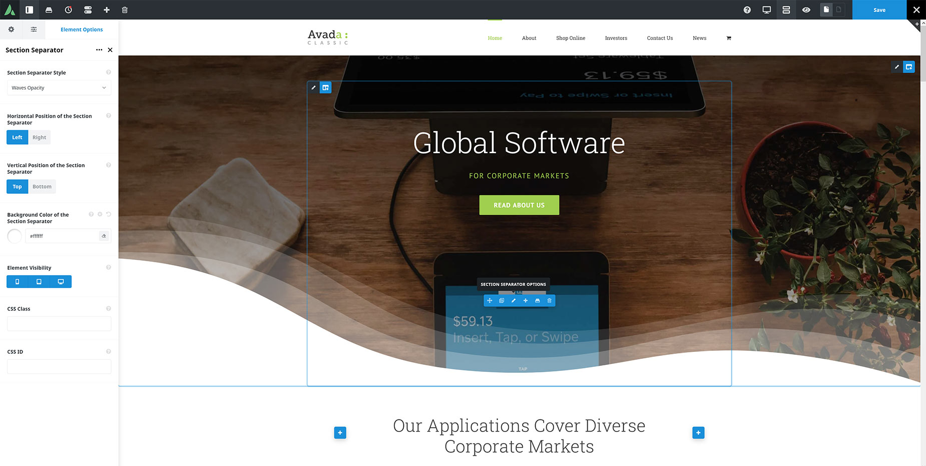
The Separator Section Element is designed to transition between two separate sections of the page. To this end, there are some conditions for the container that the separator section will be in. In our example, the Separator Section Element will be at the bottom of the container. It’s important that the Container does not have any padding at the bottom and that the Column does not have any padding or margin at the bottom. As we can see from the below screenshot, the top container has a background image, as well as a normal column layout with content. At the bottom of the content, the Separator Section Element has been placed.

Select the desired Section Separator Style and style settings. In this example, the Waves Opacity option has been selected, with the Horizontal Position set to Left and the Vertical Position set to Top. For the transition to the next container to work smoothly, the Background Color of the Section Separator should be the same color as the background color of the following container. Here, it has been set to white.

Section Separator Setup

Now add a new container. Ensure the background color of the Container is the same as has been set in the Section Separator Element. Add your content as usual.

That’s it. As mentioned, there are a lot of ways to use these section separators, so you will have to adjust the setting to suit your situation, but the basic principle is the same.

Element Options

Note: The Default setting will use the global settings assigned for this element in the Global Options > Avada Builder Elements > Section Separator section. Also, please note that the displayed options screens below show ALL the available options for the element. If you have Avada’s Option Network Dependencies turned on, you will only see options relevant to your selections, and so the options screen may look somewhat different.

General

HeadingDescription
StyleSelect the type of the separator
Custom SVG FileUpload your custom SVG separator. SVG file should include attribute preserveAspectRatio="none" for best work in combination with custom height or repeat option.
HeightControls the height of the separator. Enter value including any valid CSS unit, ex: 200px. Leave empty for auto.
RepeatChoose how many times the Separator should repeat horizontally.
Horizontal PositionSelect the horizontal position of the separator.
Vertical PositionSelect the vertical position of the separator.
IconClick an icon to select, click again to deselect.
Icon Color
BorderIn pixels.
Border ColorControls the border color.
Element VisibilityChoose to show or hide the element on small, medium or large screens. You can choose more than one at a time.
CSS ClassAdd a class to the wrapping HTML element.
CSS IDAdd an ID to the wrapping HTML element.

Design

HeadingDescription
MarginIn pixels or percentage, ex: 10px or 10%.
Background ColorControls the background color of the separator style.