Responsive Header Design With Avada
Last Update: November 30, 2025
Designing your headers for smaller screens, such as tablets and phones can be simple or challenging, depending on the header layout and the amount of content. But with Avada, there are many strategies you can employ to create successful headers for any screen size.
Read on to see some of the different strategies available, and watch the video below for a visual overview.
Strategy #1 – Logo and Mobile Menu
Let’s start with what is the simplest strategy, that also uses minimal content in the header. This is simply to have a logo and a mobile menu on all screen sizes. The easiest setup for this is two one half columns, one with an Image Element displaying the logo, and the other with a minimized version of the Menu Element. Examples of this are the Barber prebuilt, the photography light prebuilt, and the music prebuilt.
If we look at the barber prebuilt, there is also a WooCommerce Cart icon next to the main hamburger menu icon, but there is ample room on all screen sizes for the content to stay as it is.
But even here, there are responsive options as play. In this prebuilt, the designer has in fact used different column sizes on all three different screen sizes, which has the effect of controlling the size of the logo, as it is an SVG logo and can scale without loss of quality.

Strategy #2 – Separate Containers for Desktop / Tablet and Mobile
A different approach is to make completely different headers for large screens and medium/small screens. The e-bike prebuilt for example, uses two containers for large screens and another one entirely for smaller screens, using conditional rendering to control which ones get used where.
This approach can also be seen on the Energy prebuilt. On this prebuilt, the header container that renders on desktop devices, via device type rendering logic, is completely different to the header container that renders on tablets and phones.

Strategy #3 – Collapsing Menu on Smaller Screens
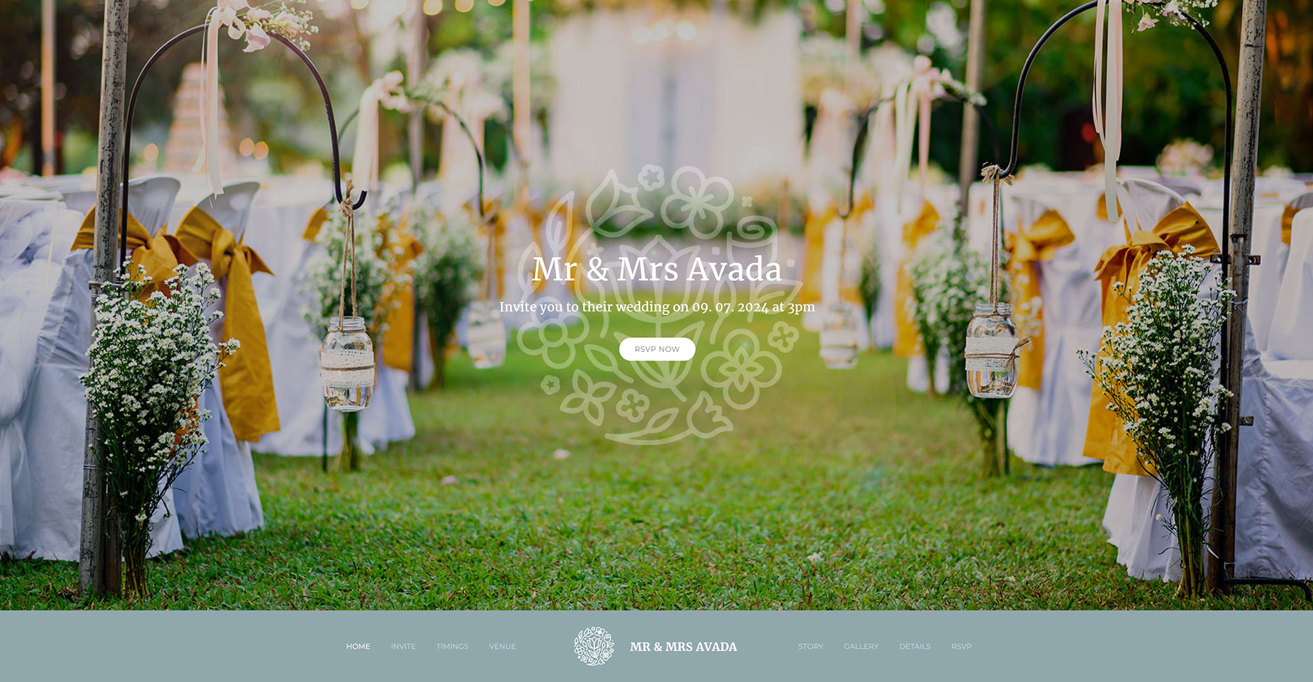
One of the most common approaches to responsive header design however, is to simply have the main Menu Element collapsing to a mobile menu on either medium or small screens. This can be seen on many of the prebuilts, including the Classic, Restaurant, Taxi, Creative, and Wedding prebuilts, as well as many others. This is a solid strategy and works in almost all situations.
Here on the Wedding prebuilt, the header is in fact at the bottom of the screen, due to a full screen Avada Slider being added above it in the page options, but only on large screens.
With medium screens and below, the header is back at the top, and the menu has reduced to a mobile menu instead.
This approach can also be taken with side headers. Prebuilts like the Cafe, agency and Resume do this, with a side header on desktop, reverting to a top iconised header on smaller screens.
This is achieved by setting the Header Position to Left in the Layout Section options of the header layout section, and setting the Side header breakpoint to medium.
So on medium screens, the header reverts to the top, and via the menu element, the mobile breakpoint set on the mobile tab kicks in and the menu collapses to a mobile menu.

Strategy #4 – Items Progressively disappearing
A more complex strategy that generally also includes the above method is when items progressively disappear as the screen size gets smaller, and potentially also change size and order.
A couple of examples of this are the Financial Advisor, Pet Supplies and Retro Prebuilts. This is usally achieved with the visibility option on the column holding the element.
If we look at the Retro prebuilt as an example, on desktop there is only one header with five separate elements visible, but on medium screens, there are only three, and on small screens, just two.


Strategy #5 – Off Canvas for Navigation on smaller screens
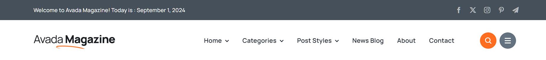
Finally, another great strategy, which is also seen on the Retro prebuilt, as well as on quite a few of the more recent prebuilts, is the use of an Off Canvas to use as the primary navigation in responsive situations. This approach can be found on the Investment, Corporation, Business, and Magazine prebuilts just to name a few.
On the Magazine prebuilt for example, on large screens there is a main menu, and an icon triggering an off canvas as well. But when we view the site on a smaller screen, the main menu disappears, and the off canvas now also acts as the main navigation.

The content in your header will best determine which of these strategies to use for successful responsive design. Download the various prebuilts to explore more about how these strategies have been achieved. Then you can pick and choose amongst the various strategies to find something perfect for your site.


