Pagination Element
Last Update: November 17, 2025
The Avada Pagination Element offers navigation controls that enable users to navigate between multiple pages of content, such as blog posts, portfolios, or product listings. The Element displays numbered links, next and previous buttons, or a “load more” functionality, depending on your chosen style.
Watch the video below for a visual overview of the Element, view the Avada Pagination Element page for live examples, and read on to see the complete list of options.
How To Use The Pagination Element
The Avada Pagination Element allows you to place pagination anywhere in a Content or Page Title Bar Layout Section, in any Single Post, Portfolio, WooCommerce Product, or Custom Post Type Layout. The Pagination Element can be placed twice in the layout to facilitate a content layout that features pagination both above and below the content, improving usability and reader engagement.
When you go to add an Element in a Content Layout Section, the Element dialog opens in a new tab called Layout Elements. This is where you will find the Pagination Element. The Pagination Element can be placed anywhere in your Layout Section. Still, in most cases, you will want to put the Element at the very top, and/or the very bottom of the Avada Content Element.
There is a range of options for the Element about how it displays. Refer to the options panels below for specific details. This Element does not include the Load More or Infinite Scroll options, as these are found in the Blog and Portfolio Elements, and it is designed for Single Post, Portfolio, and Product Layouts.
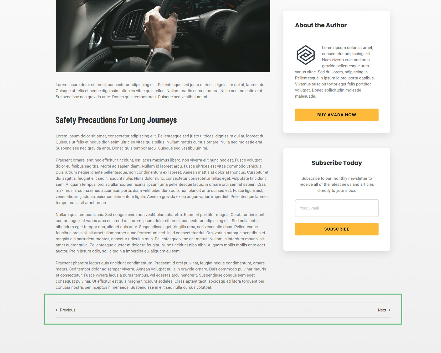
See below for an example of the Pagination Element in a Single Post Layout, displaying just below the Content Element on the Avada Taxi website’s single post.
Layout Styles
The Pagination Element includes three layout styles: “Text”, “Text With Preview”, and “Sticky Preview” which allow for more suitable product pagination in the Avada WooCommerce Builder, and is also be helpful in posts and portfolios and anywhere else pagination is required.
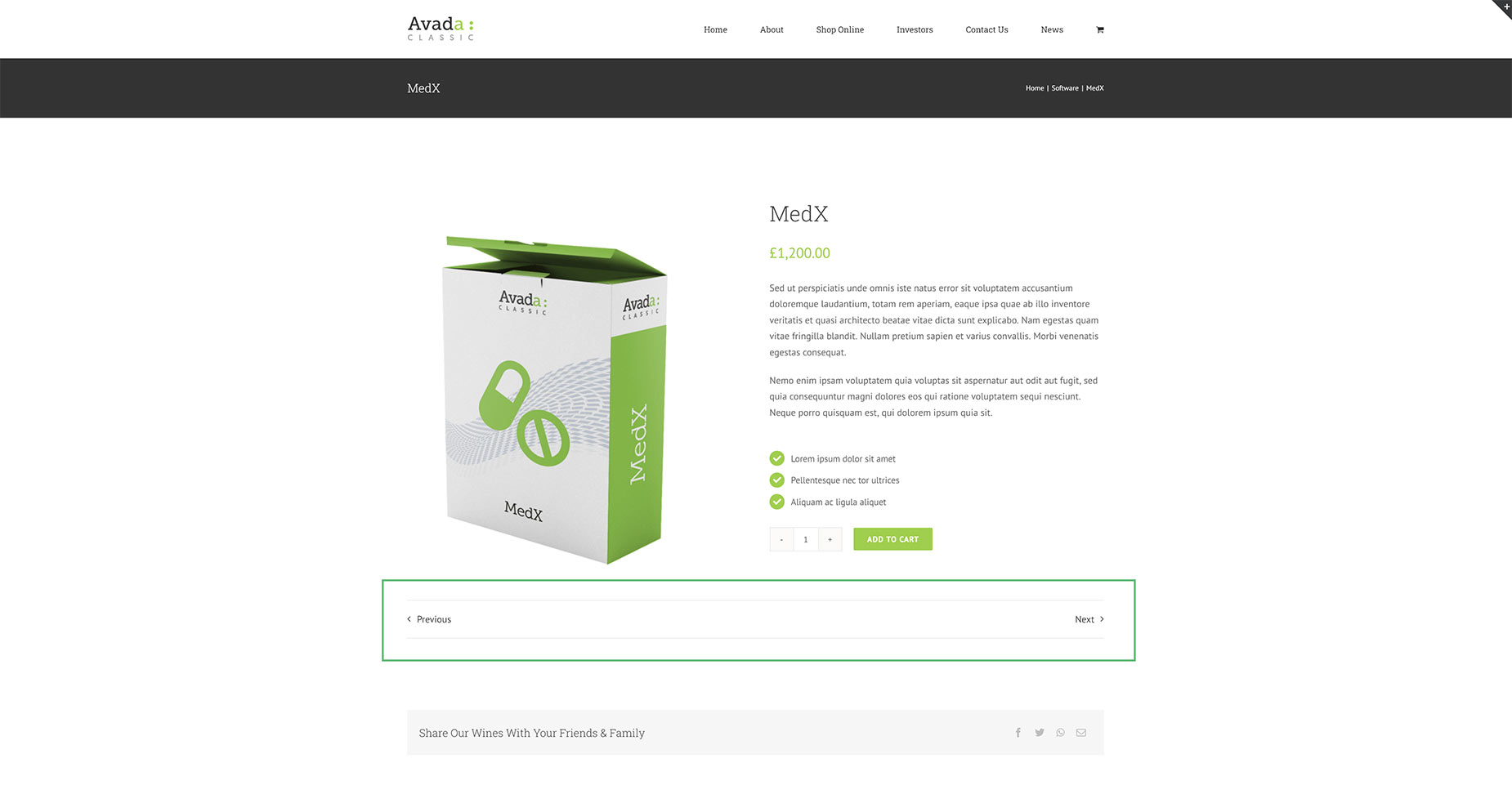
Text
This is the traditional style of pagination, typically placed at the top and/or bottom of the post. You can set the Previous/Next links to the left, or the right, or distribute them on either side of the Column. In the screenshot below, you can see the Pagination Element added below the product in a WooCommerce Product Layout.
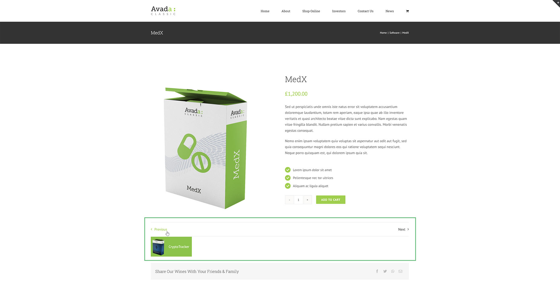
Text With Preview
This is the same as the Text style pagination layout style, but a preview of the following post/portfolio item/product, etc. is shown upon rollover of the Previous or Next link. Both of these styles are displayed in the position you place them in the layout.
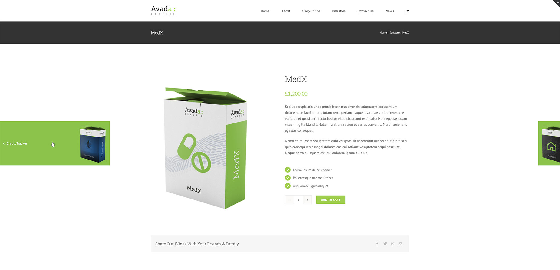
Sticky Preview
The Sticky Preview style of pagination displays a small, sticky thumbnail at either edge of the screen, positioned in the middle of the viewport. You can determine the preview height and control how much of the sticky preview is displayed before hover, and when you hover, it shows fully.
Element Options
Note: Please note that the displayed options screens below show ALL the available options for the element. If you have Avada’s Option Network Dependencies turned on, you will only see options relevant to your selections, and so the options screen may look somewhat different.


