How Avada Controls Responsive Images
Last Update: May 21, 2024
Images are a huge part of every website, and here at ThemeFusion, we are always looking for ways to improve the load time of pages by making sure that images are loaded as efficiently as possible.
We have long had features specifically for dealing with images, including multiple image sets and Retina versions of logos and other elements, We have introduced several performance related features specifically for how Avada handles images. Let’s have a look at this!
WordPress & srcset
To understand how Avada handles images, you need to know some technical background. You might know, that when you upload an image to the WordPress Media Library, WordPress actually makes 4 other sizes of that image, based on the sizes you specify in the WordPress > Settings > Media settings (plus an unlisted intermediate size). You might also know that Avada creates another 13 versions of the image as well, so that there will be an appropriate sized image for any area in the theme you might use it in. This might seem excessive, as there will be 18 files for each image uploaded, but the extra file size isn’t really that large if your initial image upload is well optimized, and the performance benefits far outweigh the extra storage.
To improve their image handling, WordPress also made some changes back in version 4.4, that added native responsive image support, by including srcset and sizes attributes to the image markup it generates. By including the available sizes of an image into a srcset attribute, browsers could now choose to download the most appropriate size and ignore the others—potentially saving bandwidth and speeding up page load times in the process.
Let’s just look at the scrcset and sizes attributes to understand their syntax.
srcset – This defines the set of images we allow the browser to choose between, and what size each image is. So the browser gets a list of available images and also the information of the width of each of these images.
Syntax
Example
sizes – This defines a set of media queries (viewport widths) and indicates what image size would be best to choose, when the corresponding media condition is true.
Syntax
Example
Browser Algorithm
Now with these 2 attributes, the browser will do the following:
- Look at its device width.
- Work out which media query in the sizes list is the first one to be true.
- Look at the slot size given to that media query.
- Load the image referenced in the srcset list that most closely matches the chosen slot size.
Avada Additions
In WordPress, not many image sizes are available by default, and most are also hard cropped. Additionally, the sizes attribute is pretty generic. So, out of the box, you don’t get you the big performance boost.
What Avada does now is:
- As mentioned earlier, we create several uncropped images, 200, 400, 600, 800, 1200 etc., which makes sure that for all kinds of devices and scenarios, the right image size will be available.
- For the sizes attribute, we check and calculate the exact content width. That is a pretty difficult task, as you can set the site width in px, but also in %. You can have full width pages, or pages with sidebars, have page padding etc. We take all of this into account.
- Additionally, we also check if your images are displayed in a grid with columns: e.g. gallery, or image carousel etc. That is important, because if you have a site width with 1200px, but have 4 columns, obviously on desktop you will only have 300px per column. Of course, we also subtract the column spacing correctly.
- For single images, we also check if they are part of a parent column, that is smaller than the full width. The reason for this is the same as above.
- Finally, we also calculate the sizes media queries in a way that makes sure your responsive breakpoints and grid column amounts are taken into account.
So in all cases, from desktop to mobile, from one column to 6 columns, from full width to double sidebar pages, we’ll give the browser all information to load the best available image size. And that, for both retina and normal screens.
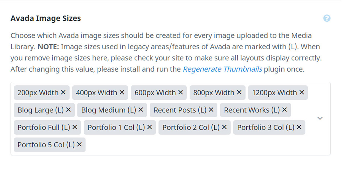
Avada Image Sizes
In the Global Options > Perfomance tab, you will also find the Avada Image Sizes option, which allows you to choose what image sizes Avada generates when you upload. As the description notes, when you remove image sizes here, please check your site to make sure all layouts display correctly, and after changing this value, please install and run the Regenerate Thumbnails plugin.
Lazy Load
We also introduced Lazy Load for images. This can be enabled under the Performance tab at Avada > Options > Performance. What this does is to only load the images that are visible in the viewport. As the user scrolls and more images come into view, they are then loaded as well. This provides an instant benefit to page load times, as only the initial images in the viewport are loaded.
Responsive Images
Apart from uploading a Retina version of your logos and favicons, you don’t need to worry about responsive images in Avada. The most important thing you can do with your images is to make sure they are well optimized. Users of Photoshop can use the Export As function, and use a fair amount of compression, and we have also found that compressor.io does a good job dealing with compression. There re also image plugins like Smush it and Short Pixel that can help. Have a read of our Image Optimization Guide for more info.
Responsive Background Images
You can also select different images for the three different screen sizes when adding background images to a Container or Column. This option is found in the Container or Column Elements, in the Background > Image Tab > Background Image option. Here you will see the Responsive Icon, and you can select the various sizes there to upload different images for your container or column backgrounds.


