Archives Element

Last Update: February 1, 2024

As part of Avada Layouts, we created a series of Dynamic Elements that help generate content in the Content Layout Section of a Layout. These are called Layout Elements. The first of these is the Archive Element.

For privacy reasons YouTube needs your permission to be loaded.
I Accept

How To Use The Archives Element

The Archives Element allows you to place archives content anywhere in a Content Layout Section, in any Layout.

When you go to add an Element in a Content Layout Section, the Element dialog opens in a new tab called Layout Elements. This is where you will find the Archives Element. These dynamic Elements can only be placed once into a Layout, with the exception of the Pagination Element, which can be placed twice. You can also use the full range of Design Elements when building your Layout.

The Archives Element can be placed anywhere in you Layout Section, and will dynamically pull Archives Content into the page, based on the settings in the Element, and the Conditions set in the Layout. For example, you might choose a Masonry Layout in the Archives Element, and set the condition for the Layout only to display on Portfolio Archives.

NB. With a Layout that has conditions showing Archives content, but where a Content Layout Section has not been specified, the Archive Layout comes from the relevant Global Options – i.e General Blog > Blog Archives Layout, and General Portfolio > Portfolio Archives Layout.

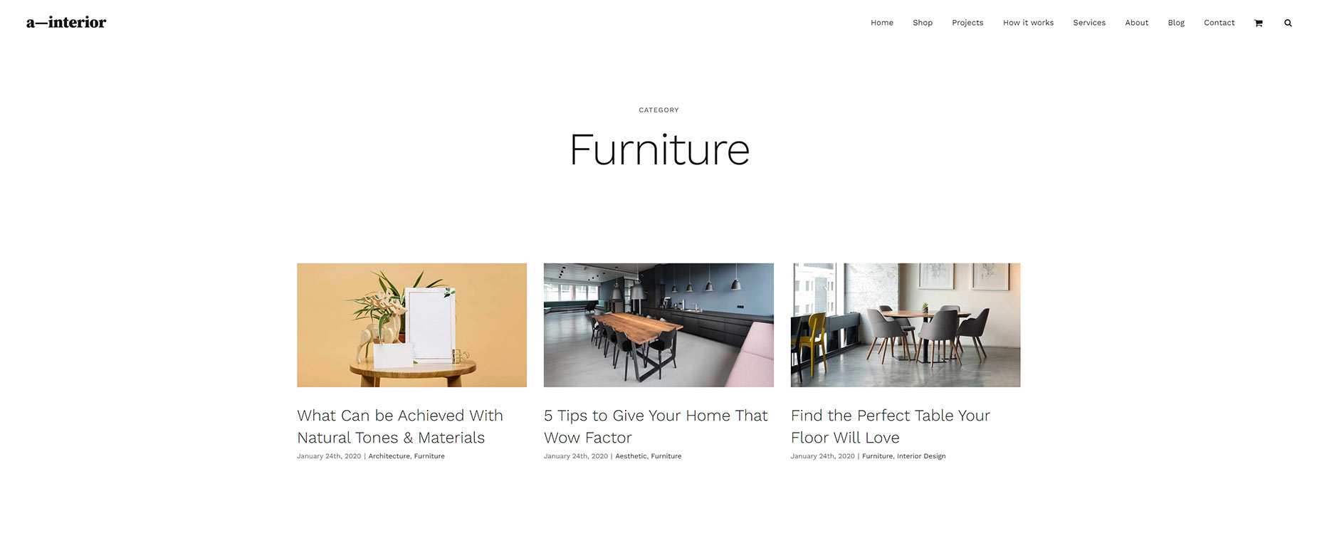
See below for an example of the Archives Element in a Category Layout, displaying in a three column Grid, on the Interior Design Demo. Follow this link for a live example.

Example of the Archives Element

Element Options

Note: Please note that the displayed options screens below show ALL the available options for the element. If you have Avada’s Option Network Dependencies turned on, you will only see options relevant to your selections, and so the options screen may look somewhat different.

General

HeadingDescription
Posts Per PageSelect number of posts per page. Set to -1 to display all. Set to 0 to use number of posts from Settings > Reading.
Content DisplayControls if the content displays as an excerpt or full content or is completely disabled.
Excerpt LengthInsert the number of words/characters you want to show in the excerpt.
Strip HTML from Posts ContentChoose to strip HTML from the post content.
Show Meta InfoChoose to show all meta data.
Show Author NameChoose to show the author.
Show CategoriesChoose to show the categories.
Show Comment CountChoose to show the comments.
Show DateChoose to show the date.
Show Read More LinkChoose to show the Read More link.
Show TagsChoose to show the tags.
Pagination TypeChoose the type of pagination.
Nothing Found MessageReplacement text when no results are found.
MarginIn pixels or percentage, ex: 10px or 10%.
Element VisibilityChoose to show or hide the element on small, medium or large screens. You can choose more than one at a time.
CSS ClassAdd a class to the wrapping HTML element.
CSS IDAdd an ID to the wrapping HTML element.

Design

HeadingDescription
LayoutSelect the layout for the element.
Masonry Image Aspect RatioSet the ratio to decide when an image should become landscape (ratio being width : height) and portrait (ratio being height : width). IMPORTANT: The value of "1.0" represents a special case, which will use the auto calculated ratios like in versions prior to Avada 5.5.
Masonry 2x2 WidthThis option decides when a square 1x1 image should become 2x2. This will not apply to images that highly favor landscape or portrait layouts. IMPORTANT: There is a “Masonry Image Layout” setting for every image in the WP media library that allows you to manually set how an image will appear (1x1, landscape, portrait or 2x2), regardless of the original ratio. In pixels.
Number of ColumnsControls the number of columns for grid layouts.
Column SpacingControls the column spacing.
Equal HeightsSet to yes to display grid boxes with equal heights per row.
Show ThumbnailDisplays featured image.
Content AlignmentControls the alignment of contents.
Grid Box ColorControls the background color for the grid boxes.
Grid Element ColorControls the color of borders/date box/timeline dots and arrows for the grid boxes.
Grid Separator StyleControls the line style of grid separators. NOTE: Separators will display, when excerpt/content or meta data below the separators is displayed.
Grid Separator ColorControls the line style color of grid separators.
Grid Text Padding Controls the padding for text when using grid / masonry or timeline layout. Enter values including any valid CSS unit, ex: 30px, 25px, 0px, 25px.