Share
In a perfect world, your WordPress site would be lovingly tended to on a fixed weekly or monthly schedule. In the real world, however, time pressure and financial and operational concerns make it all too easy for many businesses to allow the day-to-day maintenance of their site to slip off the radar. Once fresh, sites can soon start to creak at the hinges. Ironically, it’s a state of affairs that WordPress developers and designers are particularly prone to. The cautionary tale of the cobbler’s children is a famous one for a reason.
In this article, we’ll cover five classic signs that show it’s probably time for an intervention on your site. We’ve broken them out across broad areas to highlight how this problem can rear its head and suggest specific fixes where appropriate. Let’s start with the most obvious sign that your site needs some serious attention:
Overview
It’s Actually Broken
We’re not discussing disagreements over copy or a particular shade of blue in the header here. We mean the site itself is broken—simply not carrying out the job it’s there to do. “Broken” on its own, of course, is a less-than-useful diagnosis. Problems usually manifest themselves in particular areas.
Difficulties with any or all of the subsections below indicate that it could be time to go back to the drawing board with aspects of your technical stack.
Hosting Outages
Though it’s debatable whether 100% uptime is even possible, any kind of regular outage on the hosting side is a potential killer for your site in terms of user experience, SEO and revenue loss, and cannot be tolerated long-term.
Get proactive about this and put adequate uptime monitoring in place to gain an accurate picture of what’s happening. This will also help you determine whether your WordPress site needs a makeover or the environment it’s being hosted on.
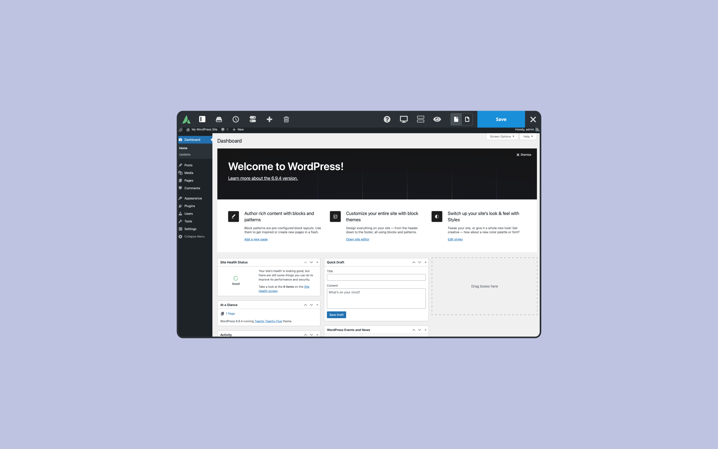
Blank White Screen
Your hosting might be rock-solid, but users won’t care about that if internal WordPress, PHP, or MySQL errors are causing White Screens of Death (WSoD) or other failures while they’re trying to navigate your site. It could be a plugin gone awry, a server configuration issue, or excessive database calls. Whatever the cause, though, you’ll need to address it immediately. WordPress ships with a range of debugging functionality in place to help you get to the root of things.
WordPress troubleshooting is a core skill in itself and one you should master to help ascertain whether you’re looking at a five-minute fix or a genuine do-over. Start getting familiar with the WordPress troubleshooting index if you aren’t already.
Link Rot
Like it or not, the web is an inherently ephemeral medium in many respects, and link rot is a given on any site if not actively monitored. Keep on top of it with a combination of WordPress specific solutions and external resources such as Google Search Console.
Think of it in terms of the broken window theory – areas of your site with broken links are likely candidates for further investigation, optimization, or improvement.
Broken Core Functionality
There are specific jobs your site simply has to be able to perform. For example, if your site’s primary purpose is lead generation, contact forms must be trackable and fully functional. If you’re running an Avada eCommerce site, you must be 100% certain that all checkout stages can be completed.
Begin by ensuring you’re crystal clear on your site’s core purpose. Use any failures you find as a high-impact diagnostic tool to indicate where a makeover of existing functionality is required. Let’s move on to our second point now, the issue of mobile devices.
It’s Not Optimized for Mobile
Have you recently looked at your site on an iPhone? Or have you reviewed its performance on a Samsung Galaxy? Having a mobile-friendly website that displays perfectly on all devices is no longer a luxury or something you should be vaguely thinking of getting around to. It’s very much a necessity.
Mobile use is set to surpass desktop use, and the numbers only go in one direction. You’re potentially cutting your online audience by over 50% if your site has problems displaying on mobile. Is that a decision you can afford to make?
Google confirmed that performance on mobile devices is an important ranking factor. If you haven’t already done so, check your site’s rating with Google’s open-source tool, Lighthouse.
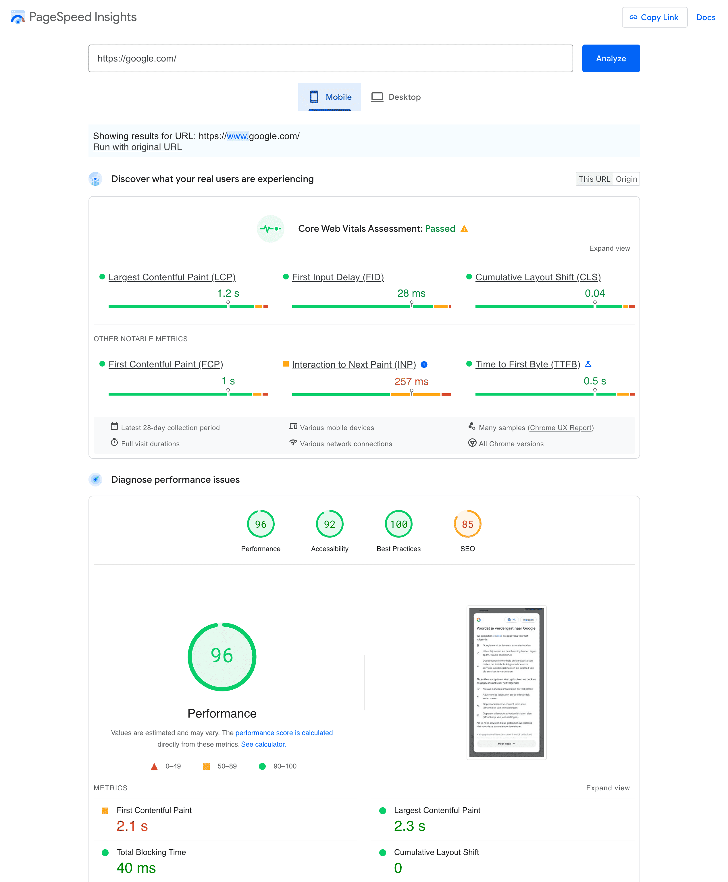
If your site is not mobile-ready, it’s very much time for a makeover. Fortunately, Avada provides a wide variety of prebuilt websites that can be imported with a few clicks and will take a huge amount of the heavy lifting out of the process. So don’t put this one off any longer if it applies to you.
You Shudder at the Thought of It
So, our first two points were very fact-led. A site is either broken or not, similar to whether it’s capable of displaying on mobile. Now, let’s turn to more subjective matters. Does your heart skip a beat when you think of your site? Or does its very mention bring on a vague feeling of nameless dread and shame?
If it’s the latter, then there’s a good chance you’ve fallen behind in one or both of the following areas and are due for a makeover:
Content
Depending on your approach to content strategy, the half-life of individual site sections or articles can be surprisingly short. Evergreen content is ideal, but not everyone has the time it takes to create it.
If it’s been months since your blog was updated, or the homepage still references that trade show you went to back in 2013, it’s time for a spring clean in this department.
Visual Design
Designers can be loathed to admit it, but online visual design is a trend-led affair with directions often dominated by industry giants such as Apple or – whisper it – Microsoft. Compared with print or offline design in general, cycle times tend to be short, and visual design solutions that looked cutting-edge a mere nine months ago can start looking distinctly passé before you know it. If you find yourself embarrassed at your current look and feel, it’s a classic sign that you should consider a facelift of some kind for your site.
Try not to be too led by the vagaries of online fashion, though. Start with the foundations of online usability and sprinkle classic design principles relating to typography and layout into the mix to build something you’ll be happy with for more than a season. Let’s move on to the subject of money.
It’s Not Bringing Home the Bacon
Websites should not be vanity projects. They are there to drive bottom-line growth for your business in a meaningful, trackable way. If you find your site’s key metrics beginning to stagnate or decline in SEO, traffic, leads, or revenue, then it is almost certainly time for remedial action.
The good news is that conversion optimization can often represent a relatively easy to implement win for sites of all sizes once you commit to going down that road.
It’s Not Social
Social media – and Facebook, in particular, – is increasing the filter through which users interact with the online world. Your site cannot be considered as an island on its own and has to be integrated into an overall content strategy that will more than likely have social media at its core.
If your site lacks social media integration or receives a low share of traffic from social, it’s a clear sign that you stand to benefit from upping your game in this department. Start by optimizing your Avada website’s existing content for social channels, then develop a social media strategy for future content.
Conclusion
If you’re planning a makeover, be careful not to overly focus on one particular aspect of your site at the expense of others. For example, a new and more modern look and feel for your site shouldn’t come at the cost of tanking your performance in terms of leads or sales.
