Share
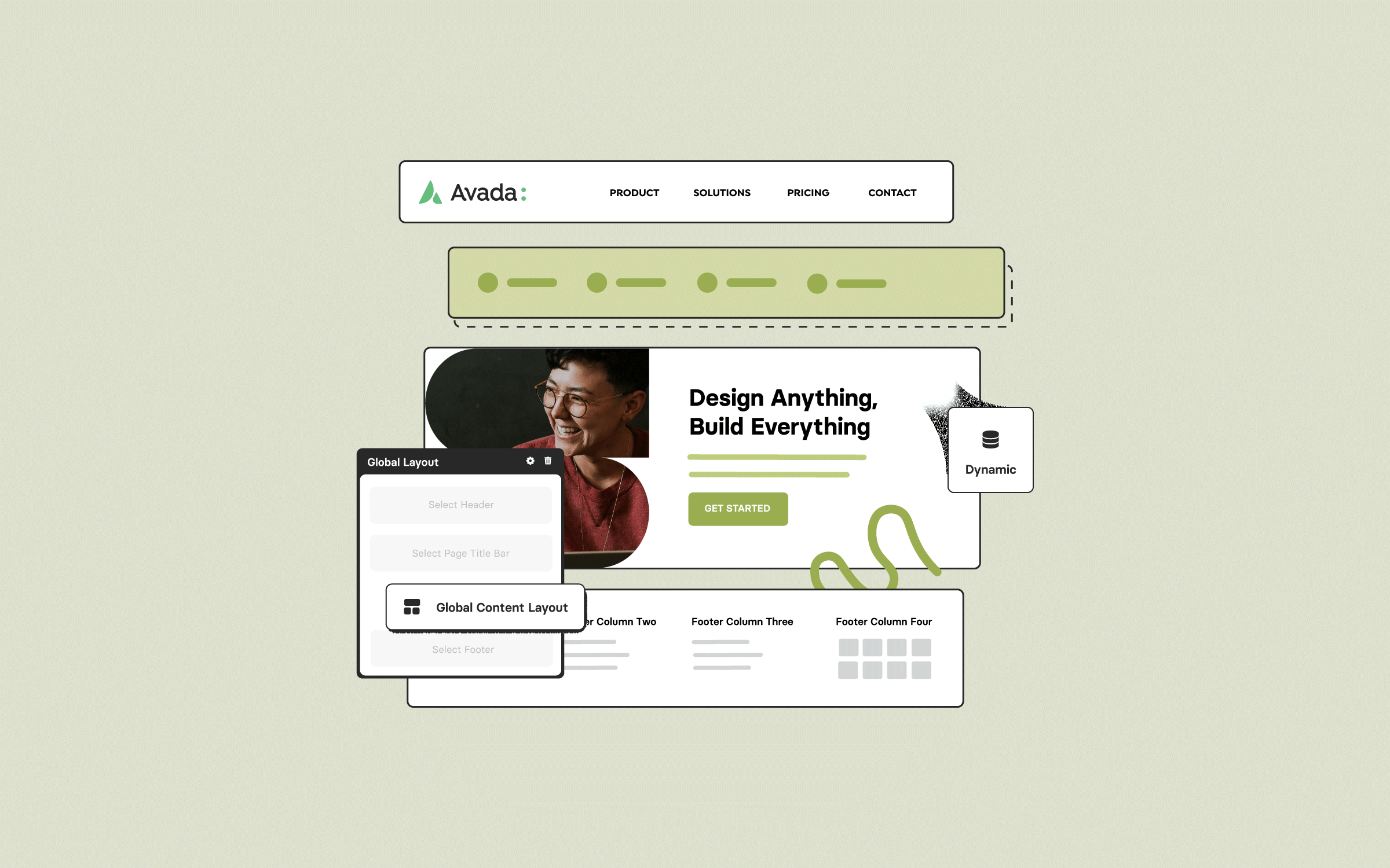
In web design, the concept of “layout” encompasses various aspects, ranging from overall structure and page composition to the precise arrangement of page elements. Using Avada and WordPress to design your website provides practical Global Layout Options to control these layouts.
This post will explore Avada’s Global Layout Options, showcasing how these settings impact a site’s appearance and providing guidance on configuring these options effectively.
Overview
Understanding Avada’s Layout Modes
Avada provides two primary website layout modes: Boxed and Wide. These two choices greatly influence the site’s overall visual layout and appearance.
In essence, Avada Layouts provides a platform for complete creative control. It allows users to design their website exactly how they envision it without being limited to static or predefined structures. This feature is essential for creating a truly customized, unique website experience.
Boxed Layout Example
The Boxed Layout encapsulates the site’s content within a defined boundary or “box.”
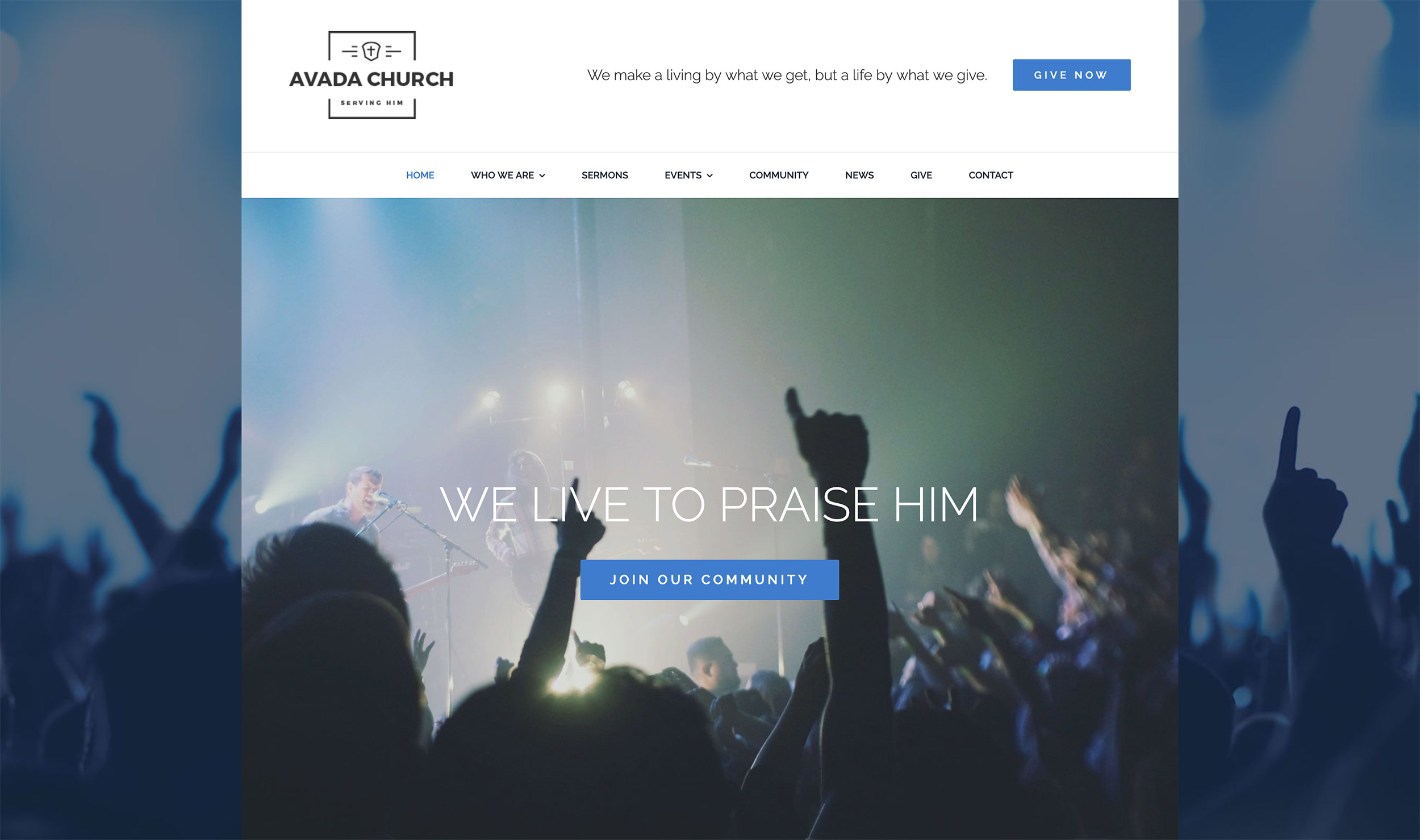
The size of this box is set using the Site Width option. For instance, the Avada Church pre-built website demonstrates the Boxed Layout with a site width of 1280 pixels. On screens wider than 1280 pixels, ample space appears around the box, while smaller screens display content without the additional surrounding space.
Using device inspection, the boxed layout behaves differently across devices. For example, the box isn’t visible on an iPad (1024 pixels wide). In contrast, an iPad Pro in landscape mode (1366 pixels wide) showcases the boxed layout.
Wide Layout Example
The Wide Layout option provides a modern, expansive appearance, with content stretching across the entire page width.
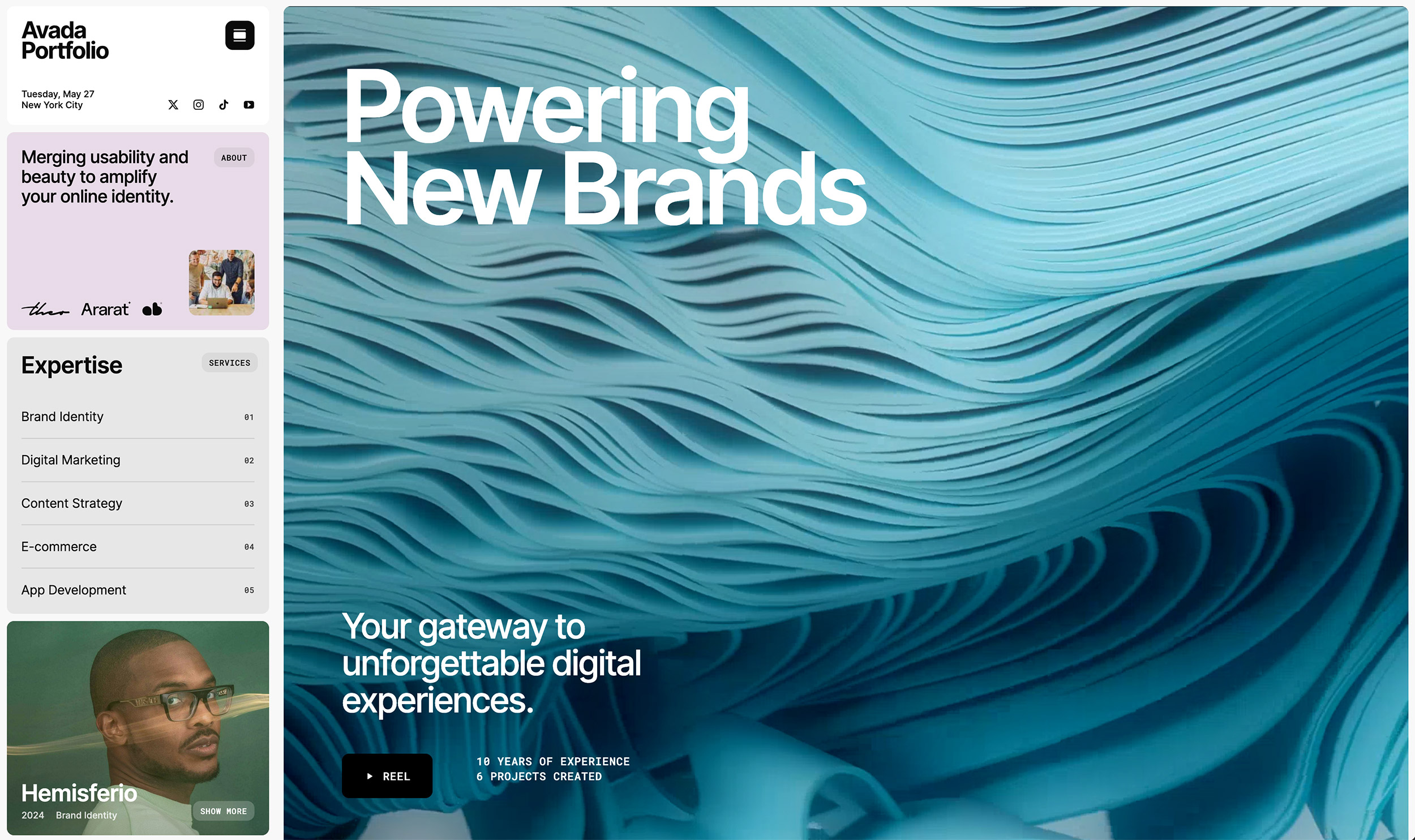
If you look at the Avada Portfolio pre-built website, you will see that the various Design Elements like Sliders, Columns, and Containers automatically adapt, occupying full horizontal space. Wide Layout is a popular option that typically combines with the 100% Width page template, allowing for selective full-width element configurations.
Site Width Configuration
Site Width can be defined in pixels (px) or percentages (%). Although percentage-based layouts offer flexibility, fixed-pixel layouts are generally more straightforward and more predictable, making them a common choice for most web designers.
Additional Avada Global Layout Settings
Avada Global Background Options
Background settings significantly complement layout modes, especially Boxed Layouts. Key settings include:
Summary
Avada’s Global Layout Options offer extensive flexibility to effectively shape your site’s visual identity. Choosing between Boxed and Wide Layouts largely depends on your design goals and audience preferences. Boxed Layouts are ideal for traditional aesthetics or when using a distinct background, and wide Layouts are Ideal for modern, spacious designs that emphasize full-width elements.


