Share
When building forms with Avada, focus often goes to the fields, layout, and submit button. However, a small Element can greatly enhance user experience after submission: the Avada Notice Element.
The Notice Element displays a message after form submission, indicating whether the submission was successful. This simple feature provides clarity and professionalism. Without it, users may wonder if their message went through; with it, they get instant feedback. The Notice Element is a valuable addition to nearly any Avada form.
Overview
What the Avada Notice Element Does
The Avada Notice Element is used inside forms to show messages after a visitor clicks submit. These messages appear based on the outcome of the form action. A successmessage confirms that the form was submitted correctly, while an error message indicates that the submission failed or requires attention.
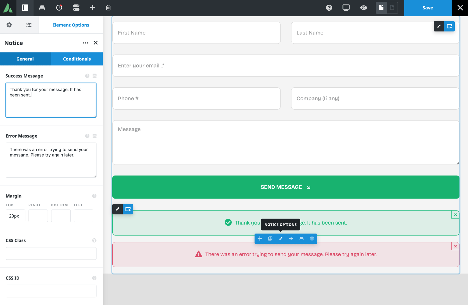
In practice, the Notice Element acts as the form’s feedback system. It closes the loop for the user, providing visible confirmation rather than leaving them waiting without explanation. After someone submits a form, they need reassurance that their submission was received—or an alert if not.
Even a basic success message makes a site feel professional and organized. For site owners, this is just as useful. A confirmation message reduces confusion and helps prevent duplicate submissions when users click multiple times out of uncertainty.
Adding the Notice Element to a Form
Using the Avada Form Builder, the Element is added directly inside a form. Once placed in the form layout, the message will display in that exact position when the form is submitted. This is an important detail because placement affects the overall user experience.
If the Notice Element is placed near the top of a long form, but the submit button is at the bottom, the page will scroll back up to the Element when the notice appears after submission.
The Notice Element Options
At the top of the Element, the success and error message fields are available. These are the two key messages the user will see depending on the submission result. Avada includes default text in both fields, which is useful for getting started quickly, but these messages can also be fully customized.
Site owners can customize the default wording to better reflect their website’s tone or the form’s purpose. Personalized confirmations or clearer instructions for errors make the form more thoughtful and aligned with the brand.
Customizing Success and Error Messages
Custom messages are where the Notice Element becomes more useful and more personal. Rather than showing a generic confirmation, the message can be rewritten to better match the brand voice or the specific action the user has taken.
For example, instead of a plain success message, a business might choose wording that feels warmer and more engaging, such as thanking the user for getting in touch and letting them know when to expect a reply. On the error side, the message can also be written in a helpful rather than abrupt way, encouraging the user to check the form and try again.
Using Placeholders in Notice Messages
The Element can include form field placeholders. This allows user-entered information to be pulled directly into the success or error notice. To do this, the form field name is added in square brackets, just as it would be in form notifications. If a form has a field named firstname, that value can be inserted into the message by using [firstname].
This enables more personalized feedback. A success message could greet users by name, giving the form a more dynamic, human feel. The placeholder must match the form field’s name exactly. This feature is especially useful for businesses that want their forms to feel more conversational without requiring complex setup.
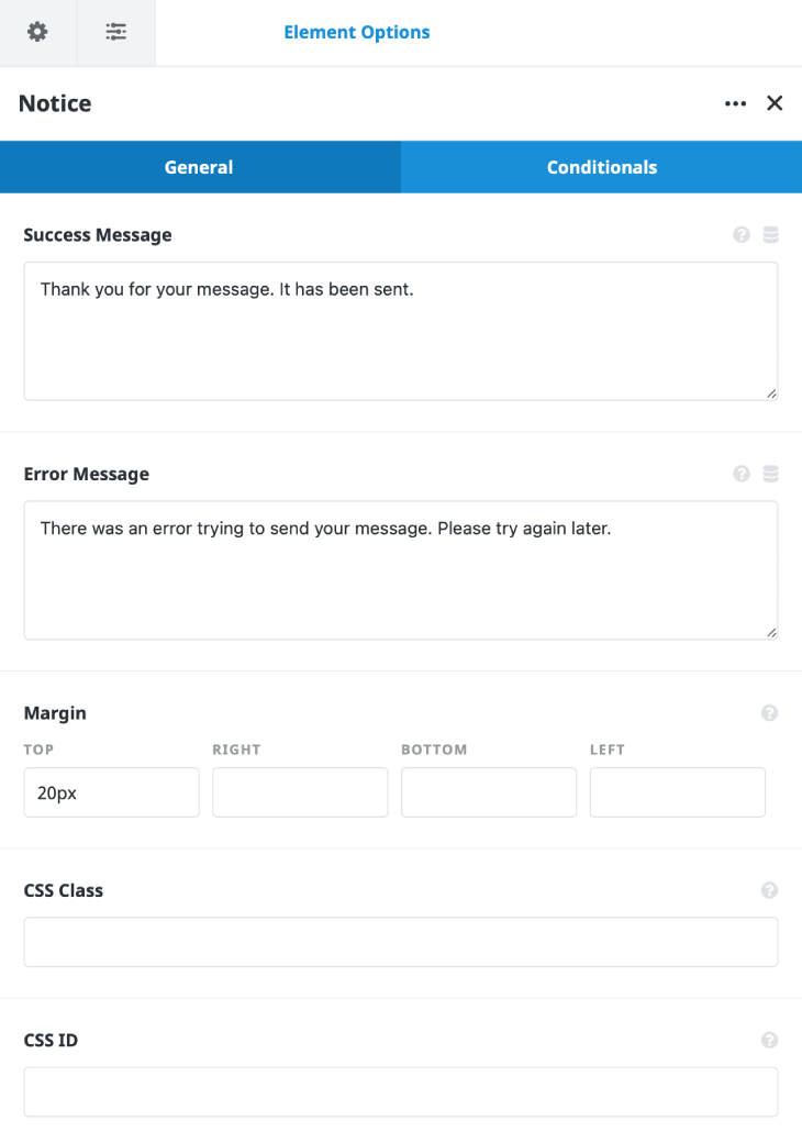
Spacing and CSS Options
Below the message fields, the margin option controls spacing around the Notice Element, helping position it neatly within the form. There are also standard CSS Class and CSS ID fields. These are useful for anyone who wants to apply custom styling or behavior to the Element.
For example, a designer may want to target a specific notice with custom CSS, or a developer may want to use the ID or class for more advanced front-end adjustments.
How Notice Styling Works
One slight difference in the Notice Element is that it lacks its own Design tab. Instead of being styled directly within the Element, its appearance is controlled by the Alert Element’s global styling. This means that the colors used for notice messages are set in the global options rather than in individual Element controls. To style form notices, the user needs to go to the Avada Dashboard > Options > Global Options > Avada Builder Elements page, and then edit the Alert settings.
Inside those settings, the success and error accent and background colors can be adjusted. Once styled there, those settings will determine how the notices appear in forms. This approach keeps styling consistent, making it easier to match notice messages to the site’s overall design.
Using Conditional Logic in the Notice Element
The Notice Element includes a Conditional Logic tab that lets you apply conditions as needed, just like other Avada Elements. That said, conditional logic is not something most users will need, since its role is already tied to the outcome of the form submission and its behavior is usually straightforward. Still, the option is there for more advanced use cases.
Summary
The Avada Notice Element may be a small part of form building, but it has a very important job. It tells users what happened after they submit a form, whether that is a successful submission or an error that needs attention. That alone makes it a valuable part of almost every form.
Its setup is straightforward, its options are easy to understand, and it also supports placeholders that allow for more personalized notice messages. When combined with global styling via the Alert Element, it offers a practical balance of simplicity and flexibility for Avada Forms.


