A landing page, often called a one-page website, is a dedicated page on a website that a user is directed to after clicking on an ad, marketing campaign, or search result. One purpose is to encourage the visitor to take a specific action, such as purchasing, signing up for a newsletter, or filling out a form or survey.
Landing pages are designed to be highly focused and optimized for sales conversions and lead capture. Unlike a typical website homepage with different content and navigation options, a landing page directs the visitor’s attention toward a specific goal. As a result, landing pages can effectively increase conversions and improve an online marketing campaign’s return on investment (ROI).
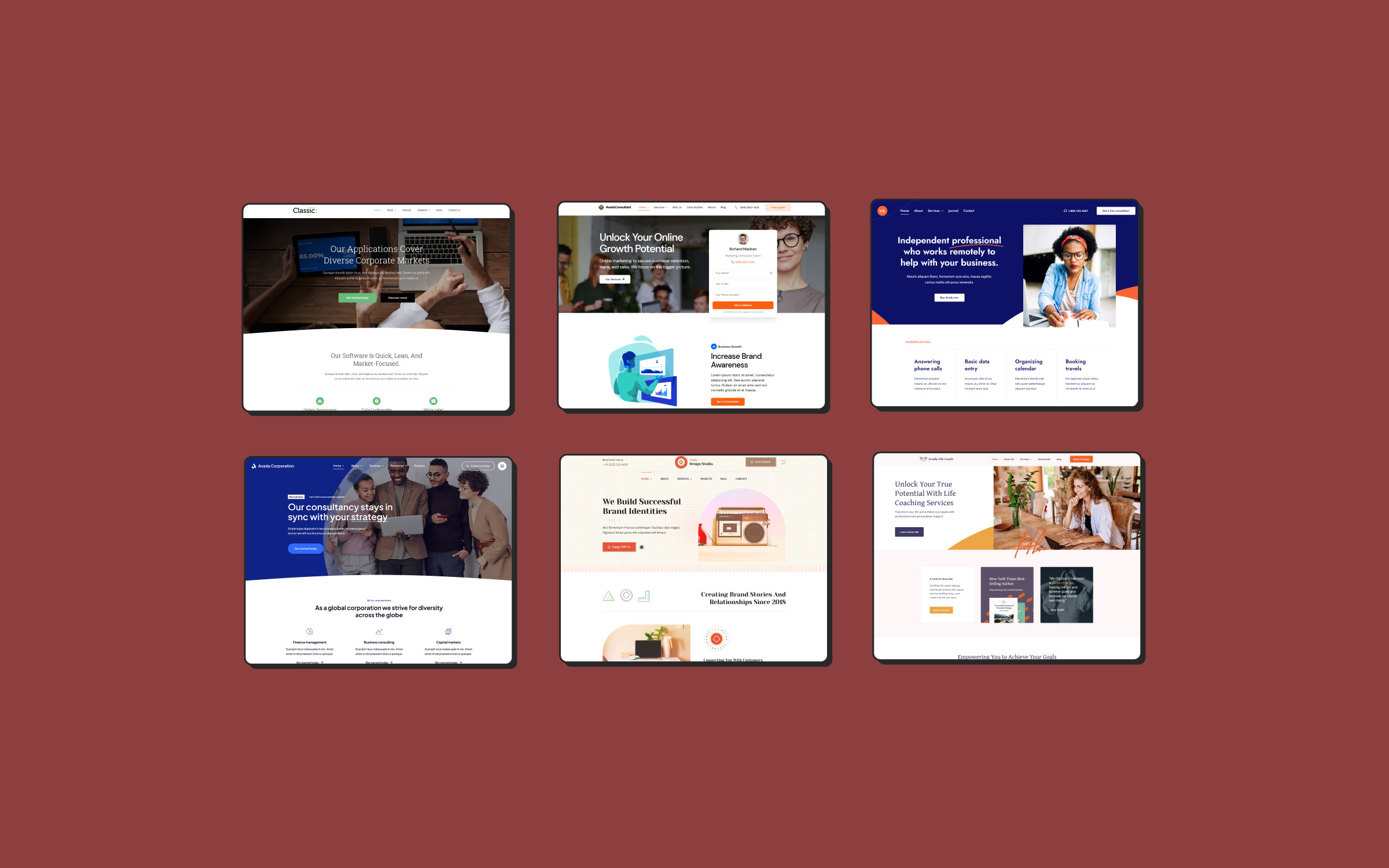
Building a successful landing page could not be easier with Avada and WordPress. Alongside the plethora of website-building tools Avada provides, there is a vast selection of Avada Studio content to choose from and ready-to-go prebuilt one-page websites for you to import with a few clicks that give you a head start. You can also check out this post that lists 10 one-page Avada websites for WordPress.
Let’s take a closer look at some key factors that should be considered when designing your ultimate landing page.
Overview
The Benefits of a Landing Page
Some key benefits are creating a platform for targeted and focused marketing initiatives is to increase conversion rates, improve visitor experience, and supply valuable data insights for your team. By utilizing landing pages effectively, you can optimize your marketing strategy and achieve more profitable results in reaching your business goals.

Focused and High Conversion: Landing pages are usually intended to stand out from the regular website style and narrative. For example, suppose a potential customer clicks on your PPC Ad (depending on the campaign’s purpose). In that case, the landing page will convert the sale or engage the customer to take a survey, etc. This method allows you to refine your narrative for a specific audience, which can significantly improve the effectiveness of your marketing goals.
Data Collection: By adding the FREE HubSpot CRM plugin to your Avada website, your marketing team can track and analyze sales activity in real time. This data will help you better understand demographics and insights about your potential customers.
Enhance Marketing Campaigns: Landing pages can significantly improve the performance of your paid ad campaigns. Google, for instance, provides a higher Quality Score to ads with landing pages directly related to the ad content, leading to lower costs per click and higher ad rankings.
Testing and Optimization: Landing pages are prime candidates for A/B testing to experiment with different content elements (such as headlines, images, buttons, etc.) to determine what drives more conversions.
Best Practices for Landing Page Design
With the right design and messaging, a well-designed landing page can be a powerful tool for driving sales and growing your business. There are best practices that will help maximize a landing page’s effectiveness when designing and refining the content. Here are some key considerations to keep in mind:
Keep it focused: A landing page should focus highly on a specific goal or call-to-action. Avoid adding unnecessary content or distractions that could detract from the main message or purpose of the page.
Use a clear and compelling headline: The headline should be concise to communicate your offer’s value proposition or benefit. Use persuasive language to grab visitors’ attention and encourage them to act or keep reading.
Include a robust and relevant visual: A high-quality visual, such as a photo or video, can help engage the visitors and make your offer more appealing. Ensure the visual is relevant to the offer and supports the campaign’s overall message.
Keep the form simple: If you use an
Avada form to collect user information, keep it as streamlined and straightforward as possible. Only ask for the essential information needed to complete the conversion. Avoid a single lengthy form loaded with multiple questions that could discourage users from completing the form. A good alternative is to build a
multi-step Avada form. A multi-step form is split into multiple pieces and used to make long forms, such as registration forms, that are less intimidating and daunting.
Use clear and persuasive copy: The copy on your landing page should be clear, convincing, and benefit-focused. Use precise language and highlight your offer’s key benefits to encourage users to take action.
Use social proof: Customer testimonials and reviews will help to build trust and credibility with your audience. Including social proof on your landing page can help to overcome objections and encourage users to take action.
Ensure mobile responsiveness: With an increasing number of users accessing the web on mobile devices, your landing page must be
mobile-friendly. Ensure the page is optimized for smaller screens and is easy to navigate on mobile devices.
Make it easy to share: If your landing page includes social sharing buttons, users can easily share your offer with friends and followers. This can increase your reach and drive more traffic to your website.
Test and optimize: Once your landing page is live, testing and optimizing its performance frequently is essential. Use A/B testing to experiment with headlines, visuals, copy, and CTAs to see what works best for your audience.
Practical Copywriting Tips
Effective copywriting is a crucial facet of creating convincing landing pages. The key strategies include using benefit-focused language to emphasize the value of the offer to the user rather than dwelling on product features. Keeping the content brief and straightforward respects the visitor’s time, making the information easily digestible. A persuasive narrative that creates a sense of urgency can motivate users to act.

Incorporating customer testimonials enhances trust and credibility, and clear and prominent calls-to-action (CTAs) should be used to guide users toward taking action. Employing elements of urgency and scarcity, like limited-time offers, can further encourage prompt action. It’s important to avoid jargon and technical language, keeping the copy clear and accessible. Regular testing and refining of the narrative, headlines, and CTAs through A/B testing can optimize conversion rates. Collectively, these techniques help craft compelling copy that engages users and drives conversions and business growth.
Consider A/B Testing Your Landing Page
Everything we’ve discussed until this point is great in theory. However, your business differs from others, and your target audience is unique to your product and services. So, how is the copy you chose working? Or is your CTA placement correct? Or what colors perform best? Or which image to choose? Or is your form working as it should? Questions without answers only provide uncertainty, which is where A/B testing comes in.
A wide selection of WordPress plugins and services provide A/B testing tools you can install and start using right away. Most are straightforward, so you don’t need advanced technical skills. It must be noted that certain tools test specific web page elements only, while others are general testing tools.
What is A/B testing?
A/B testing (also known as split testing) aims to identify the most effective version of a webpage or marketing asset that can produce the highest conversions and click-through rates. The aim is to test various aspects of a webpage, including the headline, copy, images, layout, and even small details such as the color of a button or the placement of a form field. Visitors are then randomly sent to one of the two versions. Their behavior and interactions with the page are tracked and analyzed to determine which variation performs better.
Landing Page Optimization Tips
Refining and enhancing the landing page’s performance and user experience to achieve specific goals is ongoing. The ultimate goal is to maximize the effectiveness in achieving its intended purpose, whether generating leads, driving conversions, improving search engine rankings, or enhancing user engagement. Here are some optimization tips to get you started:
Showcase your offer: Your landing page should have a clear and compelling proposition that addresses your target audience’s pain points. Highlight the benefits of your offer and create a sense of urgency to encourage visitors to take action.
Less is more: Keep your landing page design simple and clutter-free. Use whitespace, clear headings, and bullet points to make your page easy to read and navigate.
Compelling headlines and copy: Your headline should be attention-grabbing and convey the benefits of your offer. Use persuasive copy that emphasizes the value of your offer and addresses visitor objections.
High-quality visuals: Use high-quality images and videos that support your message and help visitors visualize the benefits of your offer. Avoid using stock images that look generic or irrelevant.
Call-to-action (CTA) placement: Your CTA should stand out and be easy to find. Use a contrasting color, clear text, and placement above the fold to increase visibility and encourage clicks.
Optimize your forms: Keep your form fields minimal and only ask for essential information. Use auto-fill to make the process easier for visitors. Consider using a progress bar to show visitors how far they are from completing the form.
Test variations: Conduct A/B testing to test different variations of your landing page, including headlines, copy, CTA, and design. Use data to identify the most effective elements and optimize your landing page accordingly.
Mobile responsiveness: Your landing page should be optimized for mobile devices, as more and more users are accessing the internet through their mobile devices. Ensure that your page is responsive and loads quickly on mobile devices.
Social proof: Use social proof such as testimonials, reviews, or user-generated content to build credibility and trust with visitors.
Conclusion
A landing page is a specific website page designed to increase conversions and improve the ROI of online marketing campaigns. It focuses the visitor’s attention on a single goal, such as purchasing or signing up for a newsletter. Designing and maintaining your ultimate landing page using Avada and WordPress could not be easier, especially when using the built tools like the Avada Setup Wizard, the Avada Performance Wizard, The Avada Form Builder, and so much more.


