Share
Modern web design, for it to be memorable and successful, requires a fair amount of thought and planning to ensure that you will stand out from your competitors. Furthermore, responsive header design is crucial in providing a seamless user experience across these various screen sizes when designing websites for modern devices.
With Avada and WordPress, designers can employ various strategies to create headers that adapt beautifully to different screen dimensions, from desktops to tablets and mobile devices. This guide explores some of the most effective approaches to responsive header design with Avada.
Overview
Why Is Website Header Design Important?
Website header design plays a crucial role in shaping user experience, branding, SEO, and access to fundamental areas within your website. Here are some main reasons why effective header design is paramount:
– First Impressions Matter
The header is often the first thing visitors see when they land on a website. A well-designed header can immediately engage users, create a positive first impression, and set the tone for the rest of the site. If the header is visually appealing and easy to navigate, users are likelier to engage and explore the site further.
– Navigation and Usability Is Vital
The header serves as the main point of navigation for most websites. Key assets like the menu, logo, and a search bar are typically housed in the header, providing users with a roadmap to explore the site.
A clean, intuitive header makes it easy for visitors to find the information they need without frustration. Conversely, a poorly designed or cluttered header can lead to confusion and increase the bounce rate.
– Showcase The Brand Identity
The header is a prime location for showcasing a brand’s identity. Design assets like the company logo, brand colors, and taglines help reinforce brand recognition and consistency. A robust header design that aligns with the brand’s overall aesthetic helps communicate the brand’s values and message to the audience, contributing to stronger brand recall.
– Responsiveness and Accessibility
As users access websites from various devices, including mobile phones and tablets, responsive header design ensures that navigation elements work seamlessly across different screen sizes.
A well-optimized header adapts to these changes, maintaining usability and a smooth user experience on all devices. Responsive headers also contribute to a site’s accessibility, making it easy for users with different needs to navigate the site effectively.
– Call To Action (CTA) Placement
The header is a valuable space for including essential calls to action (CTAs), such as “Sign Up,” “Contact Us,” or “Shop Now.” When designed well, these CTAs can stand out without feeling intrusive, prompting users to take desired actions.
Strategically placing CTAs in the header can lead to increased conversions, whether it’s capturing leads, driving sales, or encouraging subscriptions.
– It is Crucial For SEO and User Engagement
A well-structured header improves user engagement, which can indirectly benefit SEO. Search engines value user experience as a ranking factor. If users spend more time on your site because of easy navigation and clear layout, it can positively impact your rankings.
Additionally, headers that organize information effectively (using clean HTML code, for example) can help search engines better understand and index your content.
– It Can Improve Customer Retention
When users can easily find what they’re looking for through a well-designed header, they are more likely to stay on the site longer, return in the future, and explore multiple pages. A good header reduces bounce rates and enhances the overall user experience, leading to higher retention rates.
Different Approaches To Header Design
Responsive header design requires careful consideration. Several strategies can be employed by web designers to create effective, user-friendly headers on both large and small devices. Ultimately, the best approach to responsive header design depends on the website’s branding, style, marketing, and user experience goals.
Minimalist Styling
Less is more! One of the simplest and most common strategies for responsive headers is to reduce the header content to the essentials. This approach typically includes a logo and a menu, which remains consistent across all screen sizes. Several Avada pre-built websites follow this model, such as the Avada Barber Shop, Avada Photography Light, and Avada Music.


For example, the Avada Barber Shop website adds a WooCommerce cart icon next to the main hamburger menu icon. Despite this additional element, the design provides enough space for the content to display effectively across all screen sizes. This layout also employs responsive features, such as scaling the SVG logo without losing quality, thanks to different column sizes tailored for various device types.
Headers For Different Screen Sizes
Another common responsive design approach is using Avada conditional rendering, where different header layouts appear based on the screen size. The Avada E-Bike and Avada Energy website layouts demonstrate this strategy by having separate header containers for larger and smaller screens.


A closer look at the Avada Energy website shows that the header on desktop devices is designed specifically for large screens. A different, more compact header is displayed when switching to a tablet or mobile view, optimizing the user experience for smaller devices. This ensures that each screen size gets a customized version of the header, improving both functionality and visual appeal.
Collapsible Menus
One of the most popular strategies in responsive design is to collapse the main menu into a mobile-friendly menu on smaller screens. This technique is used in multiple Avada pre-built websites, such as Avada Classic, Avada Restaurant, Avada Taxi, Avada Creative, and Avada Wedding.


On the Avada Wedding website, the header is initially located at the bottom of the screen because a full-screen Avada Slider is placed above it on large screens. However, when viewed on smaller devices, the header reverts to the top of the page, and the menu collapses into a mobile-friendly version, creating a seamless transition between devices.


Side To Top Header Transition
Certain Avada pre-built websites were designed to use side headers for larger screens and then transition to top headers for smaller devices. This can be seen in the Avada Cafe, Avada Agency, and Avada Resume websites. These designs leverage Avada’s layout section options, setting the header position to the left on desktop screens. When the viewport narrows to a medium screen size, the header reverts to the top of the page, and the menu collapses into a mobile menu.


This type of dynamic header adjustment is made possible through the layout section’s settings, which define the breakpoint for when the side header should transform into a top header. This provides flexibility in how the header behaves on various devices, ensuring a user-friendly experience across screen sizes.
Header Designs For Different Screen Sizes
A more advanced strategy for responsive header design involves progressively reducing the visible content as screen sizes shrink. For instance, in the Avada Retro, Avada Financial Advisor, and Avada Pet Supplies pre-built websites, different header elements disappear as the screen gets smaller.


If we take a closer look at the Avada Retro website as a prime example, the desktop version displays a header with five visible elements. As the screen size moves to medium, only three elements remain; by the time it reaches a small screen, just two are visible. This method of adjusting content ensures that the header remains uncluttered and easy to navigate on any device.
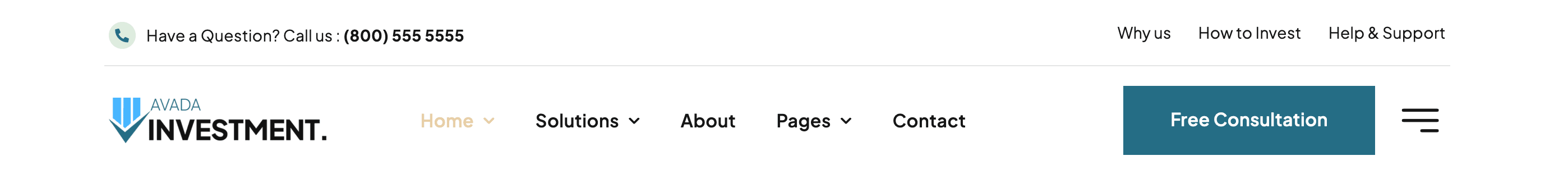
Off-Canvas Navigation
Another innovative approach to responsive header design is the Avada Off-Canvas option. This method is employed in the Avada Investment, Avada Business, and Avada Magazine websites, to name a few. The Off-Canvas menu is the primary navigation tool on smaller screens in these designs.


For instance, on the Avada Magazine website, the large-screen version includes a main menu and an icon that triggers an Avada Off-Canvas menu. On smaller devices, the main menu disappears entirely, and the Off-Canvas menu becomes the primary form of navigation. This creates a clean and intuitive experience for mobile users while maintaining easy access to navigation options.
Summary
Choosing the right strategy for responsive header design depends largely on your website’s content, structure, and overall marketing goals. Avada offers a wide range of pre-built websites and pre-built header layouts and features via the Avada Studio that make it easy to implement different methods, from minimal content headers to more complex designs with conditional rendering and Off-Canvas navigation.
Designers can mix and match to create a responsive header that suits their needs, ensuring the website remains functional and visually appealing on any screen size.


