Flexbox for Containers and Columns
Last Update: April 11, 2024
Back in Avada 7.0, we completely re-imagined both the Container and Column elements, basing them on CSS Flexbox. This means that extremely flexible positioning and spacing is now standard in the Avada Builder. At the same time, we kept our classic setup for Containers and Columns in case you want to keep using it on pre-existing sites.
Read on to discover more about the Flexbox related changes to the main structural elements in Avada, or watch the video below, for a visual overview. For a full overview of all individual options, please see the Container and Column Element docs.
What is Flexbox?
You can read more about ithere, but basically, Flexbox is a CSS3 layout model, that provides a more efficient way to lay out, align and distribute space among columns inside a container, even when their size is unknown and/or dynamic. The main idea is to give a container the ability to alter its columns’ width/height (and order) to best fill the available space, allowing responsive elements within a container to be automatically arranged, depending upon the screen size.
So in Avada 7.0, you will find new options in both the Container and the Column Elements. The main way this change affects how you can build is in Alignment and Spacing options.
In the Container Element, you will see three new options – Row Alignment, which defines how rows should be aligned vertically within the container (this will only fully work when multiple rows of content are in the container), Column Alignment, which allows you to select how you want columns to align with rows, and Column Justification, which allows you to control how the columns are aligned horizontally in the container.
And in the Column Element, you will find the new Alignment option, which defines how the column should align itself within the container (this overrides what is set on the container) and the Content Alignment option. This defines how the column content should align, and only works with full height columns.
To get a visual idea of what these options can do in practice, we will look at some examples, but first, it’s important to understand when you will see these new flex containers and columns and when you won’t.
Legacy Support
Legacy Support for Updated Sites
Legacy Support for the old Container and Columns will be automatically enabled when updating existing sites to Avada 7.0. This will mean, that on an updated site, all existing Containers and Columns will not change and the Flex options will not be enabled for existing Containers. If you create a new Container, however, it will use the new Flex options.
If you want to convert your Legacy Containers to Flex, you can simply disable Legacy support in Global Options > Avada Builder Elements > Container > Legacy Support. If you do this, your existing containers will automatically switch over to the new flex method. If you see problems with this on your old containers, you can turn legacy mode back on and your containers will return to their old state. Note, not all setups can be 100% converted to flex mode and kept identical automatically.
Our recommendation is that after updating you should turn off legacy mode in the options. Unless you have problems with the way the containers display, we would suggest leaving this off and only using the new Flex options. If you have problems on only a couple containers of the website, then we would suggest disabling legacy and then manually updating that area with the new options, but you have the choice to leave it as is.
Legacy Support for New Sites
On a new site, installed on Avada 7.0, Flex Containers will be on by default. If you want to access the old Containers and Columns, you will need to turn Legacy Support on. Although, on a new site, we see absolutely no reason not to just use the new Flex Containers and Columns.
To enable/disable Legacy Support, just go to Global Options > Avada Builder Elements > Container, where you will find the Enable Legacy Support Option at the very bottom.
Container Flexbox Options
The Container Element has several new options directly related to the Flexbox changes, which allow great flexibility in how you position your content within the container: These are Row Alignment, Column Alignment, and Column Justification.
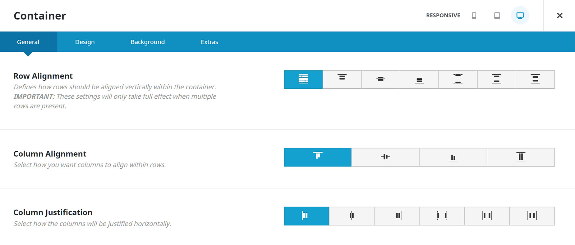
Row Alignment
The first of the Container Flexbox options is Row Alignment – but this option only be visible when Full Height or Minimum Height is selected for the Height option. Rows are the space the columns take up in a Container before they break into a new row. This option defines how rows should be aligned vertically within the container, and therefore will only have full effect when there are multiple rows of content in the Container.
Options are Stretch, Top, Center, Bottom, Space Between, Space Around, and Space Evenly. See below for examples of what this can achieve.
Examples of Row Alignment
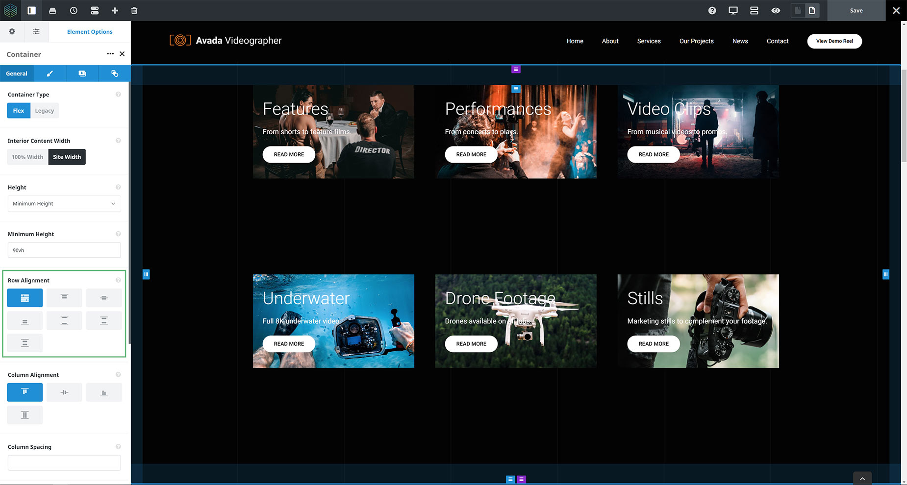
Let’s start with a Container that has two rows of Columns. But before we look at the alignment of the rows, let’s look at the Container height. As mentioned already, the Row Alignment option will not show when Auto is selected for the Height option, because in that case, there is no extra room in the Container for the options to fully work. You can, however, use the Full Height Option, or even the Minimum Height option.
In the example below, I have set the container to Minimum Height, with a specified Minimum Height of 90vh (this equates to 90% of the Viewport height), but as long as there is extra room in the Container, you will see the effect.
Apart from the Container Height, the Container below also has 50px padding at both the top and bottom of it, but with all other settings on default, we can see the two rows as they appear in the Container in the first image below.
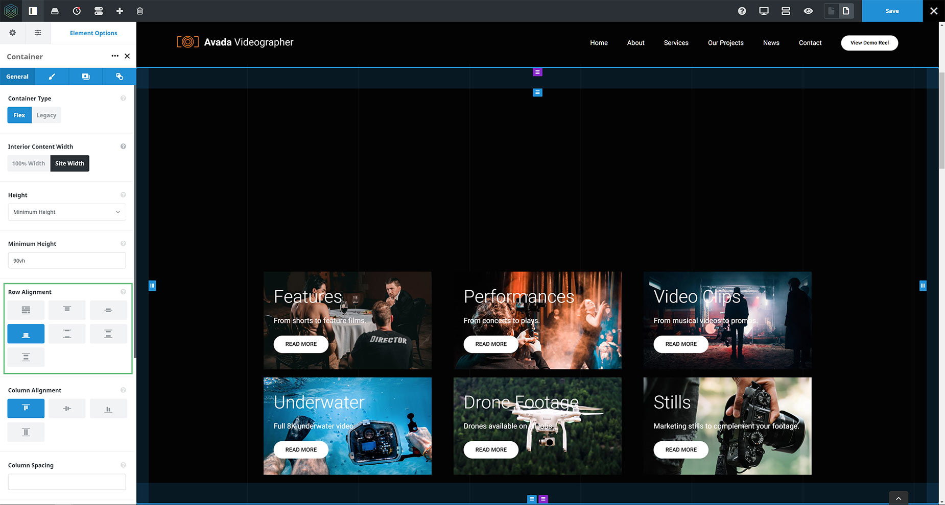
Row Alignment – Stretch
The default selection with the Row Alignment option is Stretch, which means the Row will stretch to take up all available space. Note how the Columns themselves are not changing in size with this option, as this is the Row that is being affected.
In terms of positioning, with two rows in the Container below, this actually means that the rows are each placed in 50% of the container height, and aligned to the top, with the first row taking up to 50% of the available vertical height, and the second row under that, also aligned to the top of its 50%.
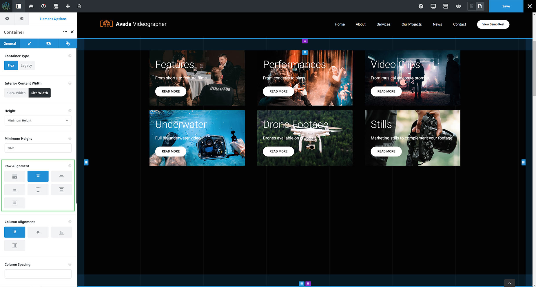
Row Alignment – Flex Start (Top)
The next few selections are very simple. With the Flex Start selection, as you can see, both rows of Columns are aligned to the top of the Container.
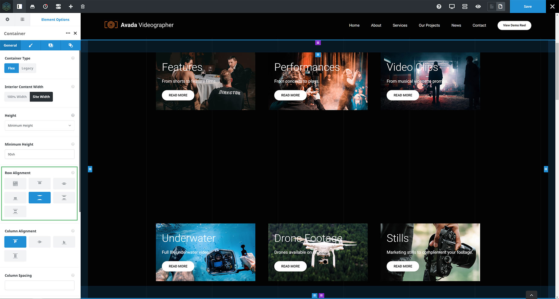
Row Alignment – Center
With the Center selection, both rows of Columns are aligned in the center of the Container.
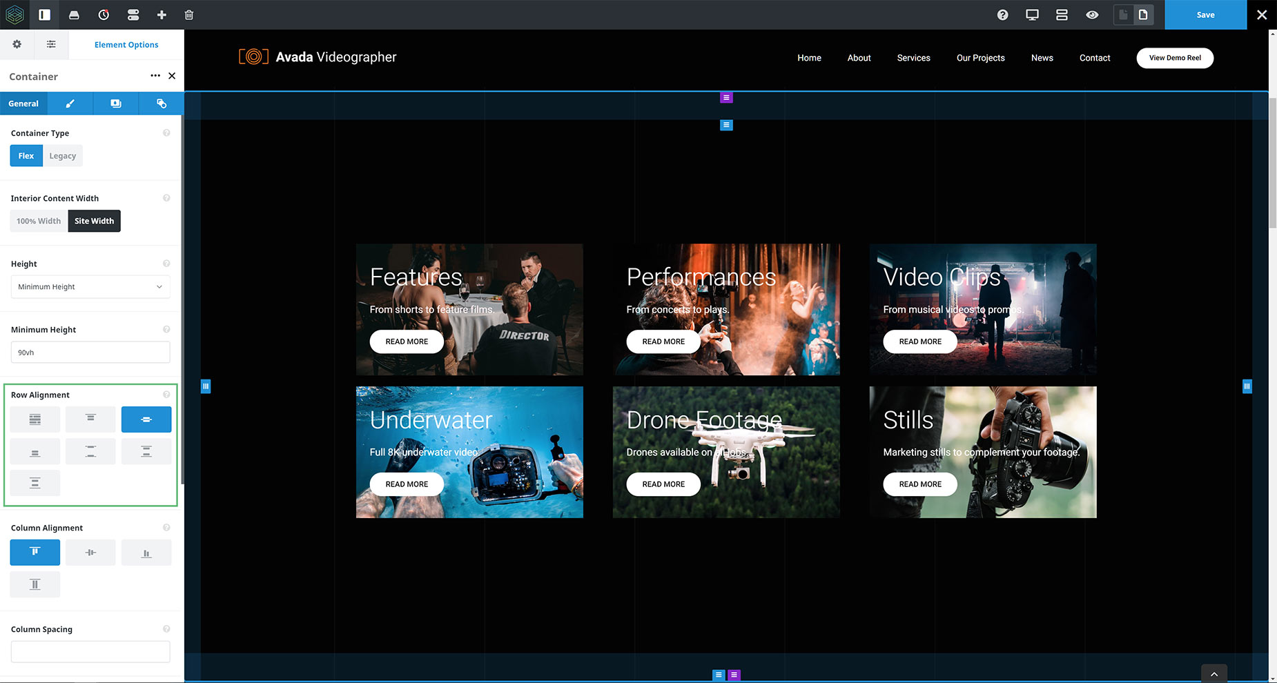
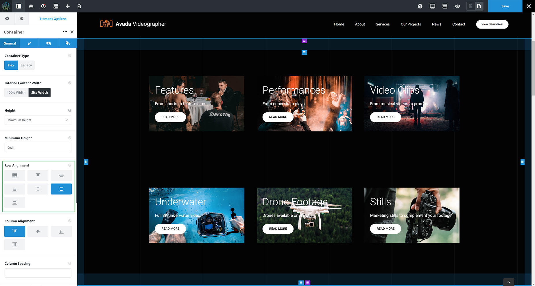
Row Alignment – Flex End (Bottom)
With the Flex End selection, both rows of Columns are aligned to the bottom of the Container.
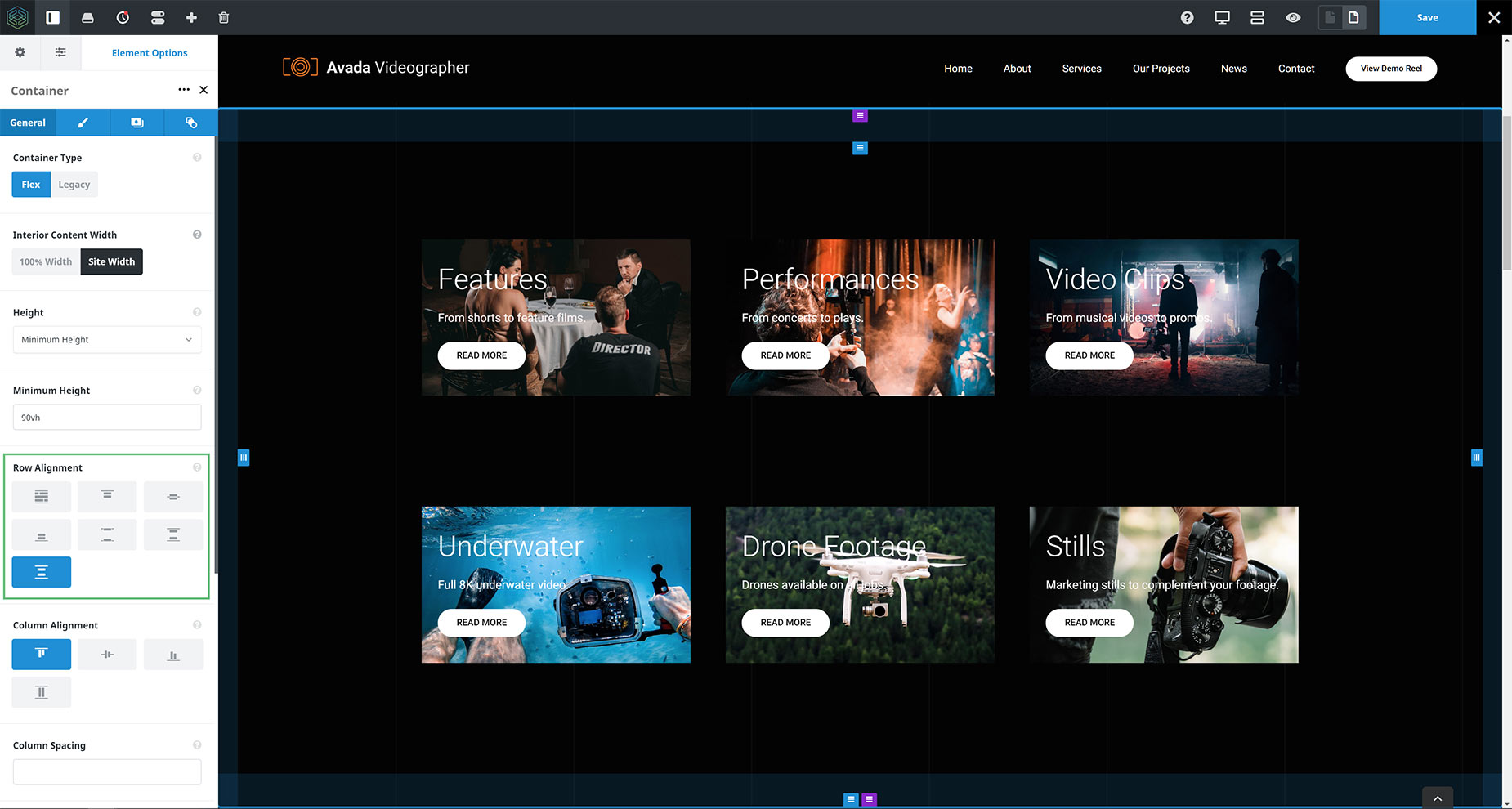
Row Alignment – Space Between
With the Space Between selection, both rows of Columns are aligned to the top and the bottom of the Container respectively, maximizing the space between them.
Row Alignment – Space Around
With the Space Around selection, both rows of Columns are aligned in the middle of their 50% area, with the same amount of space above and below them. This is why the space in the middle is twice as big as the space above and below the rows.
Row Alignment – Space Evenly
With the Space Evenly selection, the available space in the Container is equally divided between above, between and below the rows of Columns.
Column Alignment
The next Flexbox option is Column Alignment. The Column Alignment option allows you to select how you want your columns to align within rows.
Options are Top, Center, Bottom, and Full Height. Using the Full Height selection is, for example, how you achieve equal heights of columns. Let’s look at the various options.
Examples of Column Alignment
For the images below, I started with a Container, with default Flex values, and then added some padding to the top and bottom of the Container.
We then have 3 Columns with content of varying length. If your content has identical length, you won’t see these options take affect, as the Columns are already aligned.
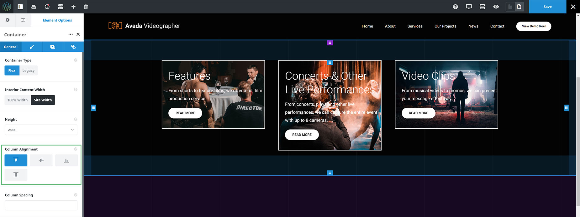
Column Alignment – Flex Start (Top)
This is the default selection, and as you can see in the image below, the Columns are all aligned to the top of the Container.
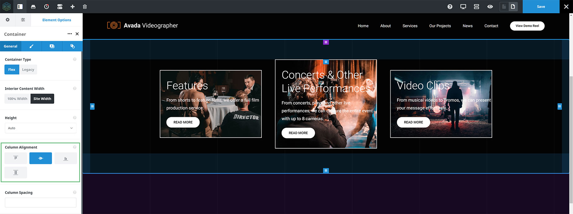
Column Alignment – Center
The Center selection aligns the Columns with their center point.
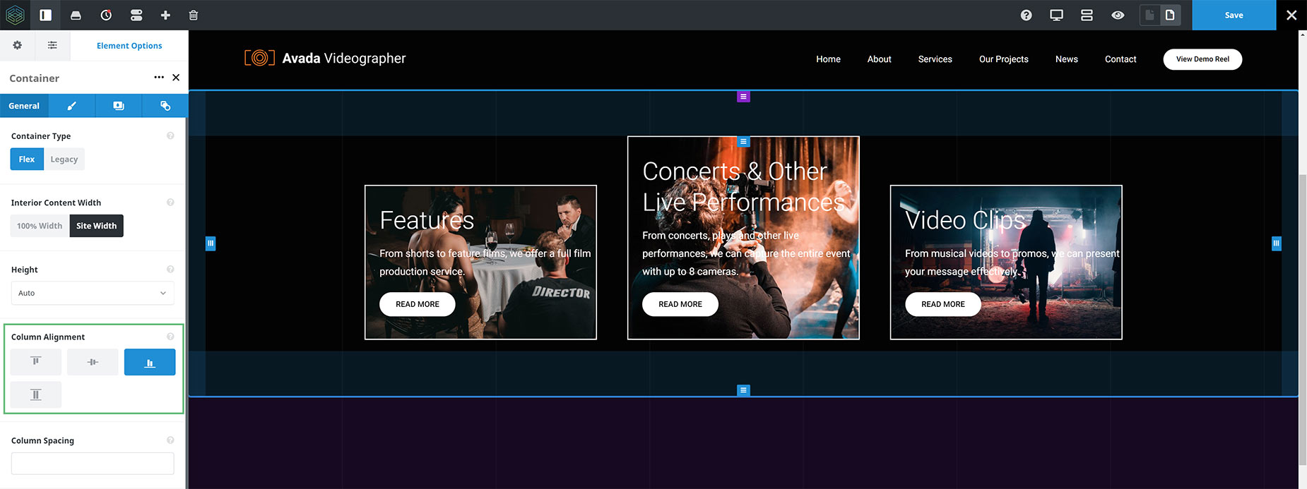
Column Alignment – Flex End (Bottom)
The Flex End selection aligns the columns by their bottom edge.
Column Alignment – Stretch (Full Height)
The Stretch selection makes the Columns all the same height, stretching the shortest Columns to the height of the tallest. Note, however, that there is not necessarily any alignment of the elements inside these Columns. This would depend on the content. For this, there is the Content Alignment option, found in the actual Columns. For more detail on this, head down to the Content Alignment Option.

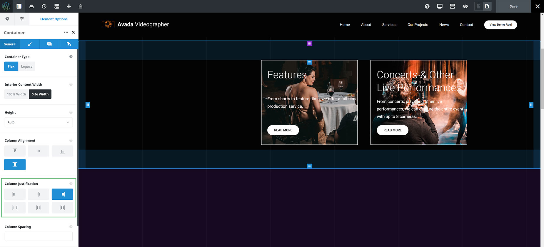
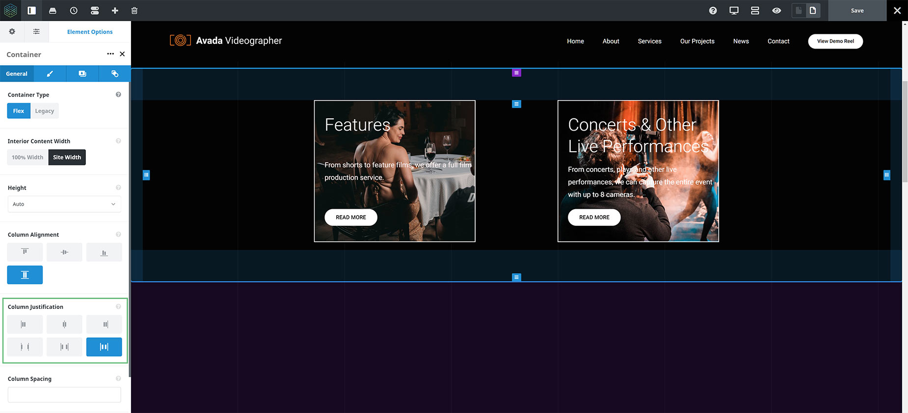
Column Justification
The next Flexbox option is Column Justification. The Column Justification option allows you to select how the columns will be justified horizontally. For this option to have any effect, the Row cannot be full. If the Columns that make up the row add up to the full width (eg. 1/3 + 1/3 + 1/3) then there is no room to justify the content horizontally at all. If, however, you have a single 1/2 size column, or two 1/3 columns in a row, then there is room for horizontal justification.
Options are Flex Start, Center, Flex End, Space Between, Space Around, and Space Evenly. Let’s look at the various options.
Examples of Column Justification
For the images below, I started with a Container, with two 1/3 Columns, with Column Alignment set to Full Height, and Content Alignment set to Space Between.
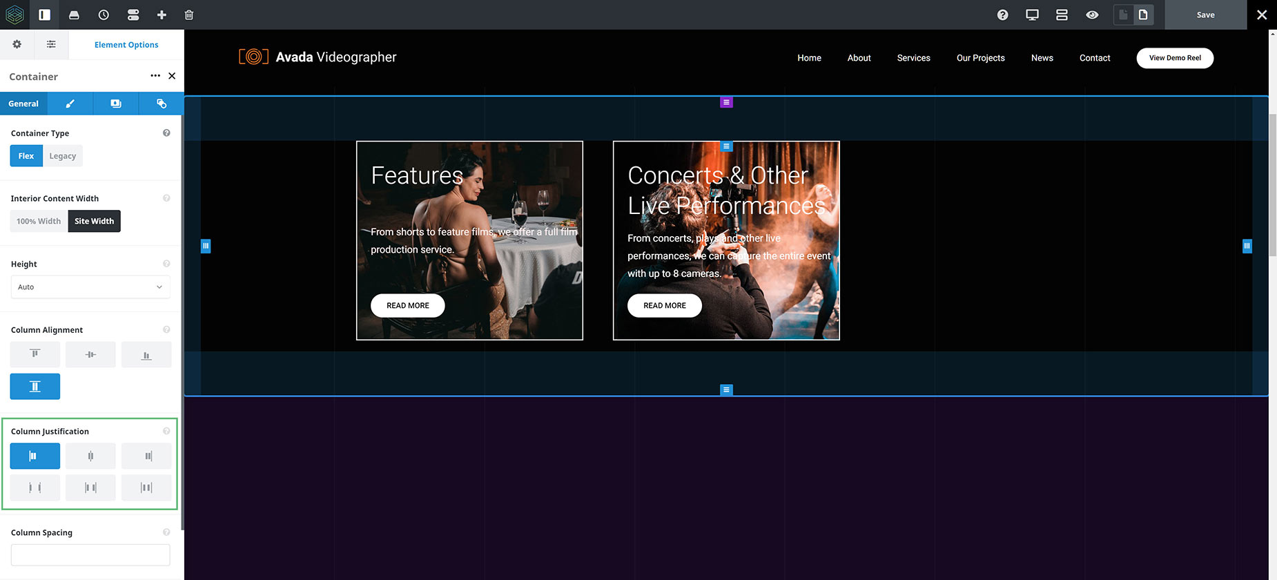
Column Justification – Flex Start
Flex Start is the default selection, and as you can see in the image below, the Columns are all justified at the Start of the Container.
Column Justification- Center
The Center selection justifies the Columns horizontally in the center of the Container.

Column Justification – Flex End
The Flex End selection justifies the Columns horizontally at the end of the Container.
Column Justification – Space Between
The Space Between selection places each Column at either end, to maximize the space between.

Column Justification – Space Around
The Space Around selection places the same amount of space on each side of each Column. Note that visually the spaces aren’t equal, since all the items have equal space on both sides (within the Site Width). The first item will have one unit of space against the container edge, but two units of space between the next item because that next item has its own spacing that also applies.

Column Justification – Space Evenly
The Space Evenly selection distributes the Columns so that the spacing between any two items (and the space to the edges – in this case the Site Width) is equal.
Column Flexbox Options
The Column Element has two new options related to the Flexbox changes, which control the alignment of the individual Columns, and the alignment of the content within them. They are Alignment, and Content Alignment.
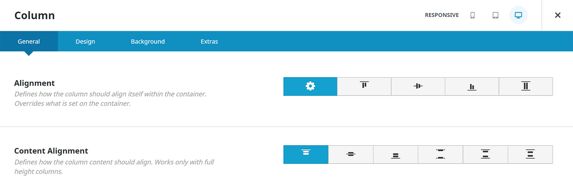
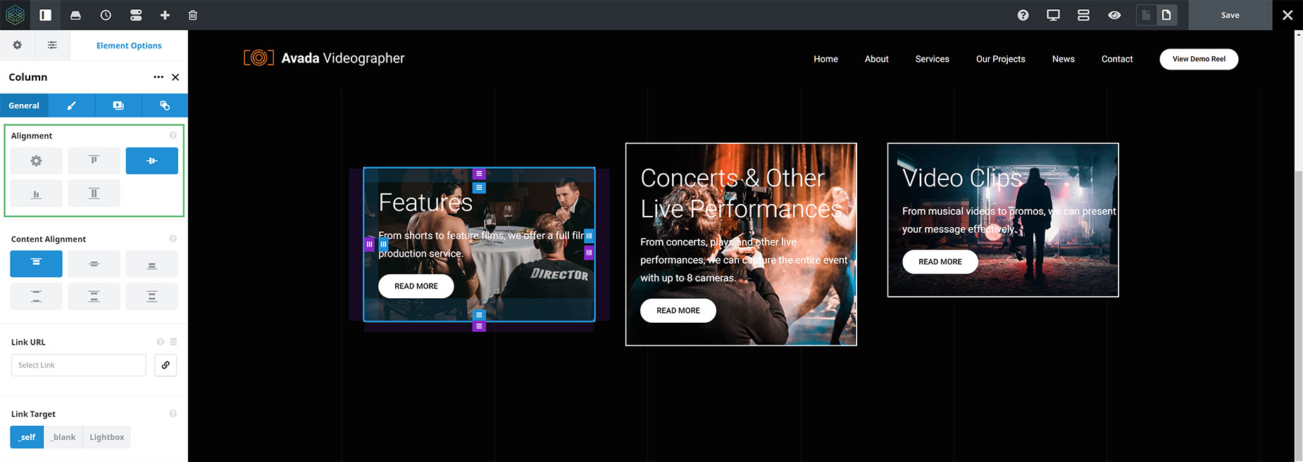
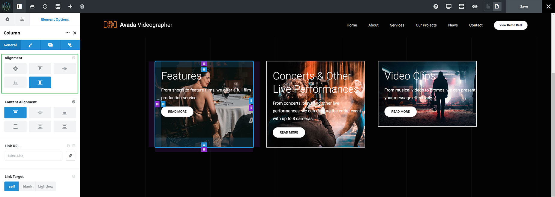
Alignment
This is an individual Column Alignment option. It defines how the column should align itself within the container, and overrides anything that is set on the corresponding container option. The main difference to note here is that the Container > Column Alignment option affects all the Columns inside the Container, while the Column > Alignment option only affects the Column it is set on.
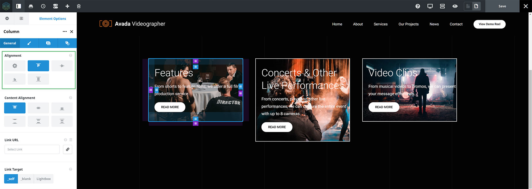
Examples of Alignment
For these examples, we will continue with our previous example of a Container with 3 Columns, with the Column Alignment option left on the default value of Top.
Alignment – Default
As the default value for this option is Default, this means that it inherits from whatever is set on the Container > Column Alignment option. In this case, that was Flex Start (Top).

Alignment – Flex Start (Top)
When changing to the Flex Start selection, because the Parent Container option is also set to Flex Start, the selection does not change anything.
Alignment – Center
Center Alignment aligns the center of the selected column to the middle of the Container.
Alignment – Flex End (Bottom)
Flex End Alignment aligns the bottom of the selected column, along the baseline Container (minus any Container padding).

Alignment – Stretch (Full Height)
Stretch aligns the column to the height of the Container (again, less any padding).
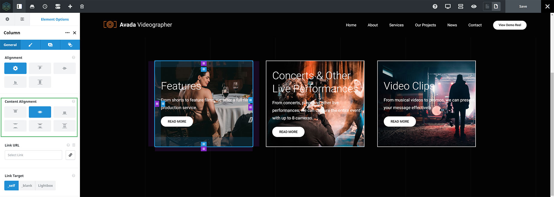
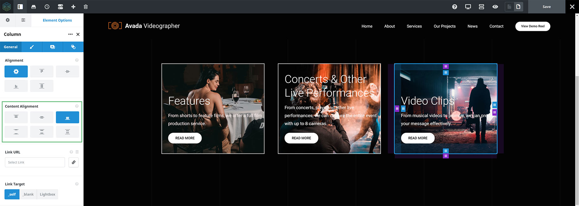
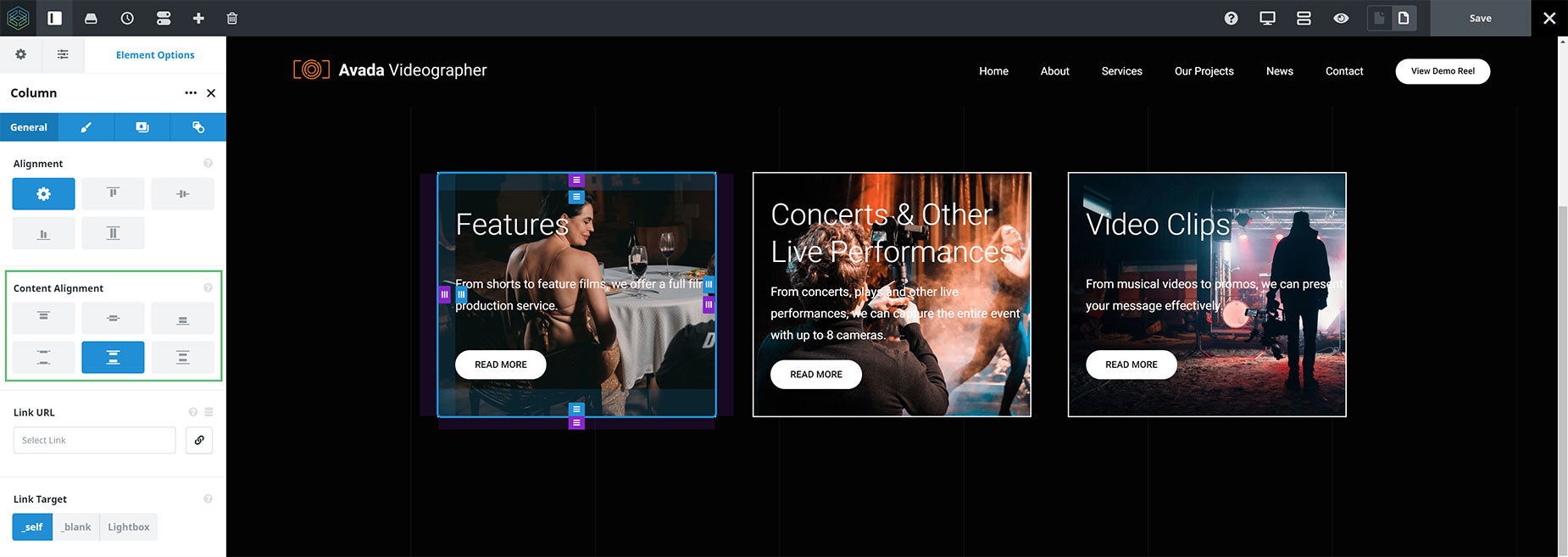
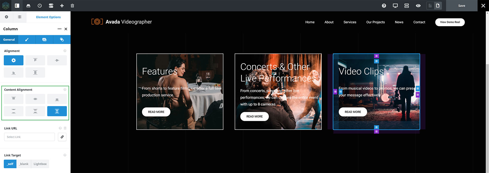
Content Alignment
This option allows you to control the alignment of the content within the individual Columns. This option only works for Columns where the Content > Column Alignment option, or the Column > Alignment option has been set to Full Height (this is not the same as Full Height Containers). Options are Top, Center, Bottom, Space Between, Space Around, and Space Evenly.
Examples of Content Alignment
For this example, let’s start with the same content as we did for the Container > Column Alignment option, with the Full Height selection. See how the Columns are the same height, but there is only alignment with the Titles at the top. Let’s see how this option can adjust the alignment of the content within the individual Columns.
Content Alignment – Flex Start (Top)
This is the default selection with this option. The Titles align at the top, but that is all.

Content Alignment – Center
Here, all three Columns have been set to Center. This centers the content within the Columns. Note how, that due to the differing amounts of content in the middle Column, only the two outside Columns’ content aligns.
Content Alignment – Flex End (Bottom)
Here, all three Columns have been set to Flex End. This aligns the content along the bottom of the Column, but now the Titles are not aligned.
Content Alignment – Space Between
Here, all three Columns have been set to Space Between. In this situation, this arguably gives us the best results, as it means that the top and the bottom of the content are aligned, with the space distributed in between.

Content Alignment – Space Around
Here, all three Columns have been set to Space Around. In this situation, the content is almost aligned, but because the middle Column has a differing amount of content, it doesn’t quite align with the other two.
Content Alignment – Space Evenly
Here, all three Columns have been set to Space Evenly. Again, in this situation, the content is almost aligned, but again, because the middle Column has a differing amount of content, it doesn’t quite align with the other two.
Depending on the amount of content you have in your Columns, these options will work quite differently to the examples shown here, and with equal amounts of content, you will have the most options.
Other Flex Related Options
There are a few other options in the Flex Containers and Columns that are also enabled by Flexbox. These are the Order option in the Columns Element, and the Responsive Option Set feature found in both. For more information on both of these, please see the How To Set The Display Order And Size Of Columns In Responsive Layouts and the Responsive Option Sets documents.
Conclusion
So as the name suggests, and the examples bear out, Flexbox is all about flexibility of layout. With the introduction of Flexbox into the structural Column and Container Elements, we have introduced an unprecedented level of flexibility when it comes the the layout and alignment of containers and their child columns.


