Global Option Header Layouts
Last Update: April 17, 2024
With Avada Layouts, you can build your own fully custom headers in Avada. See Introducing Avada Layouts and How To Build A Custom Header to learn more about this powerful feature. When building a custom header in Layouts, you can either start with a blank template, or alternatively, you can also import any of the pre-designed headers included in Avada Studio, into the Header Layout Section as a starting point, to then customize further for your Custom Header.
But Avada still offers a range of 7 customizable one-click Header Layouts via the Avada Global Options, which you can find at Avada > Options > Header > Header Content. Each Header Layout offers a different look and set of features, so it is important to familiarize yourself with each one.
Following on from the Main Header Setup document, where we look at the Header Options available in the Global Options, in this document we look at examples of each of the 7 header layouts that can be assigned from the Global Options, and how they are configured.
Header Position
The Header Layouts display at the very top of the page by default, but in the Avada Options (Avada > Options > Header > Header Content) there are also options to display the header at the left or the right of the page, as well as above or below any Slider. The main menu height, header padding, and logo margin options will auto-adjust based on your selection for ideal aesthetics. Let’s take a deeper look at each individual Header Layout.
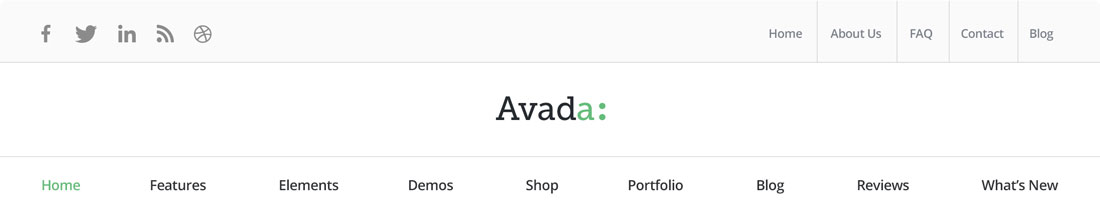
Header 1

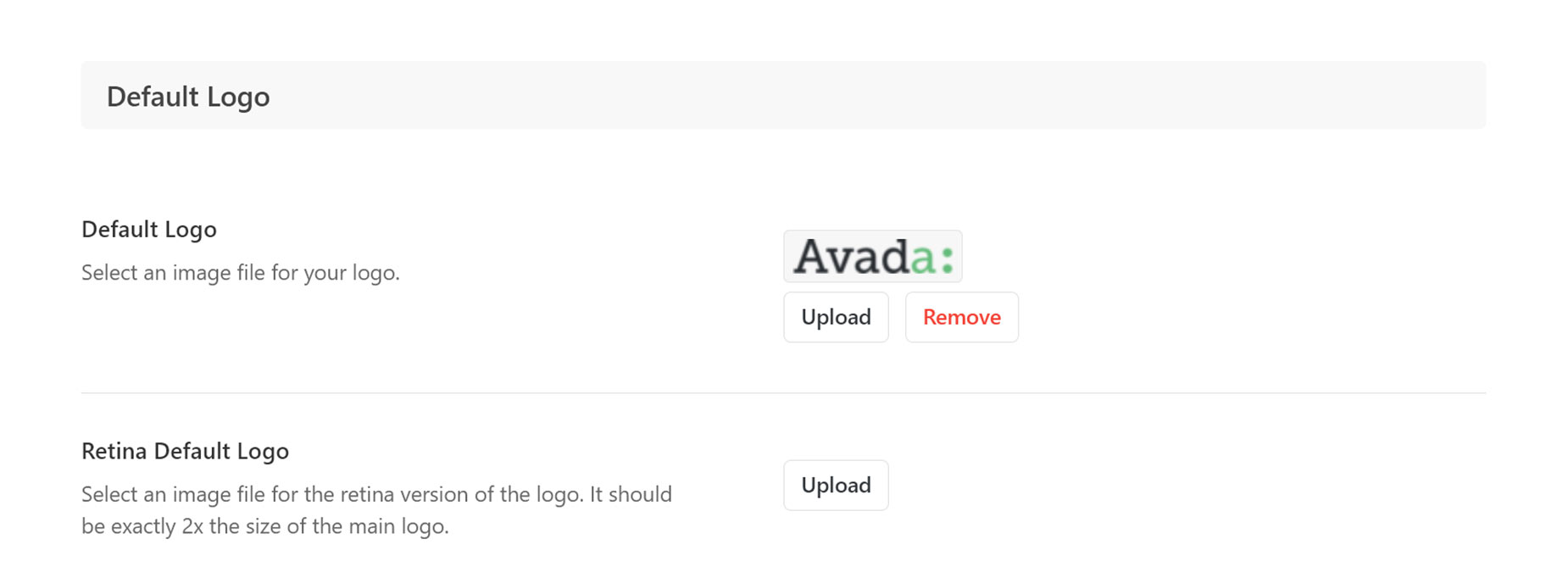
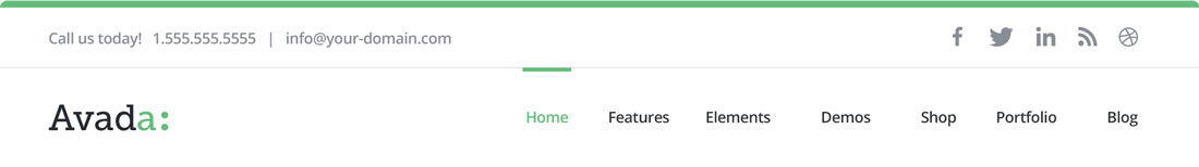
Header 1 is a simple layout, with the Logo on the left and the menu on the right. The Logo is inserted through the Global Options at Avada > Options > Logo > Default Logo. Note that there is also a field, directly below the default Logo, for a Retina Logo, which should be exactly twice the size of the default Logo. This is so the logo is crisp on Retina-enabled screens. For more information on how Avada controls responsive images, please read this article.
For the menu items to show in the Header, you must first create a menu in Appearances > Menus, and then allocate the menu to the Main Navigation Display Location. For menu styling, navigate to Avada > Options > Menu > Main Menu for a large variety of styling options, as well as the Avada Menu Options found in the individual menu items in the WordPress Menus.
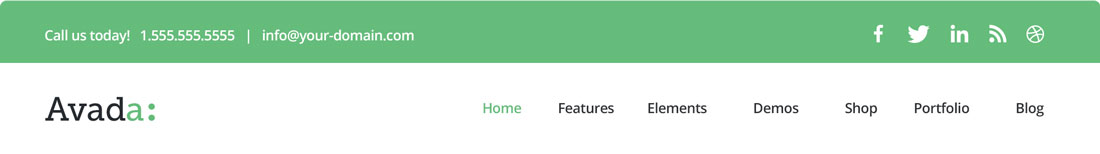
Header 2
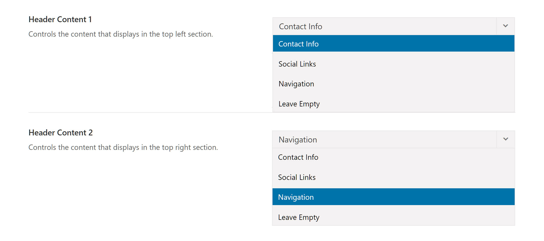
Header 2 has the addition of a Header Top Section, which offers a space, both to the left and to the right, for additional content. The options for both the left and the right sections are: Contact Info, Social Links, Navigation or Leave Empty. These options are applied via the Header Content 1 and 2 options in the Avada > Options > Header > Header Content section.
Contact Info is entered directly below the Header Content 3 option. There is a Phone Number For Contact Info field, and an Email Address For Contact Info field.
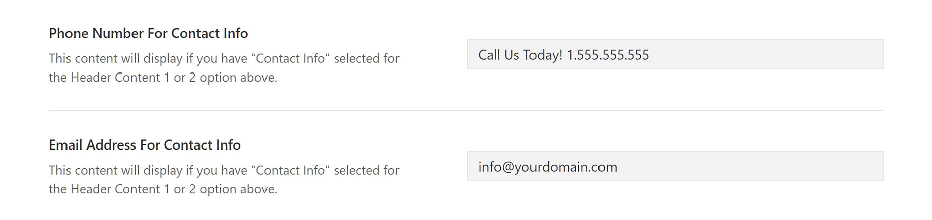
If populated, the email address will be automatically linked with a “mailto:” html tag. Additionally, you can make the Phone Number clickable, by using the “tel” html tag, when entering the number. Example below.
Header 2 also has a 3px line at the very top of the menu, which gets its color from the Site Color, found in Avada > Options > Colors > Primary Color. By default the Header Top background color is white, but it can be changed to any combination of color and transparency you wish, via the Color Picker found at Avada > Options > Header > Header Top Background Color.
Header 3
Header 3 is essentially the same as Header 2, but with a few small differences. The thin 3px line at the top is removed and the Header Top section, by default, takes on the primary theme color. Of course, this can be changed via Avada > Options > Header > Header Styling to any color and transparency you wish.
Header 4
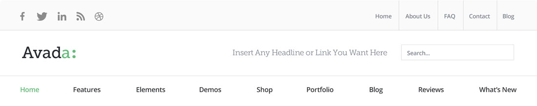
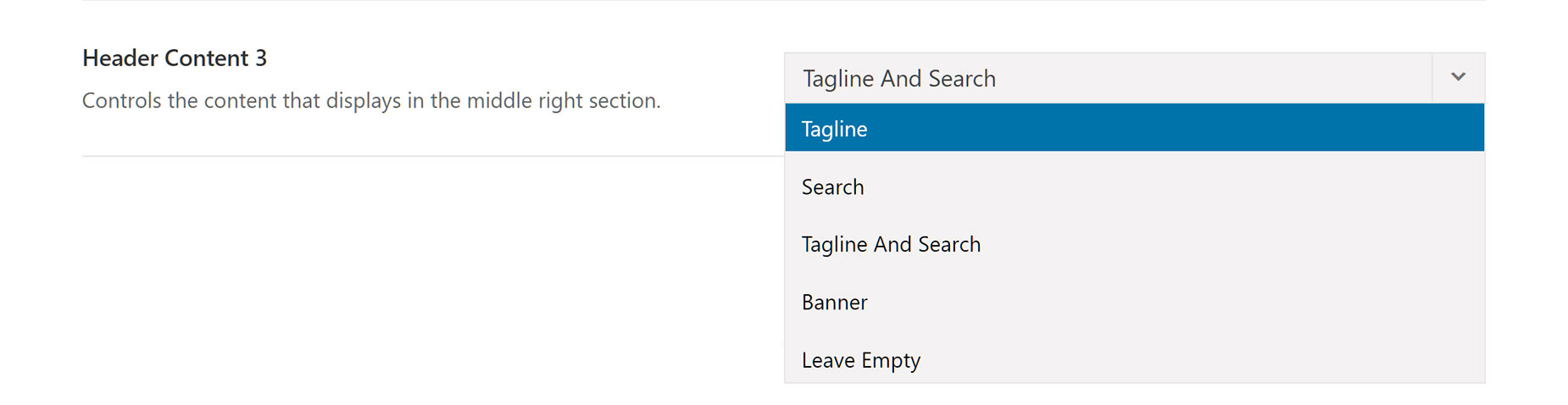
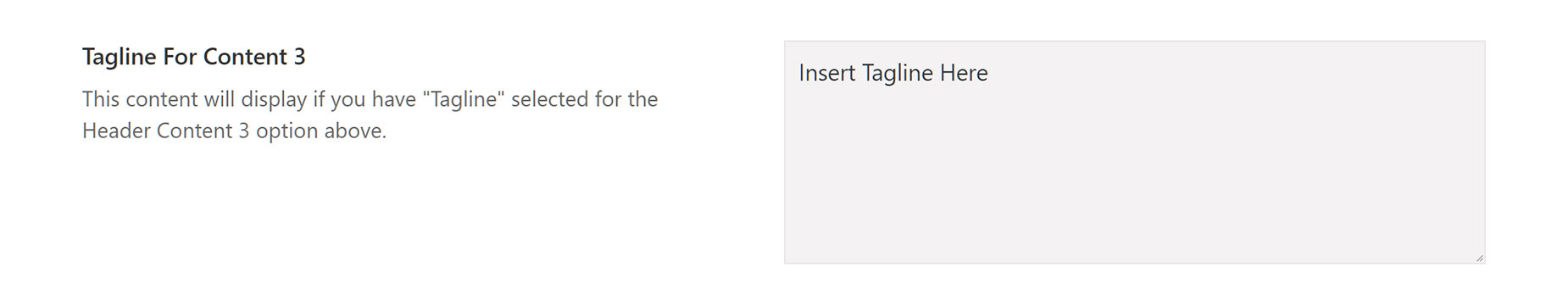
Header 4 makes changes to the logo and menu area. The Header Top section is the same as in the previous Header layout, but below that, the middle section contains the Logo to the left and adds a configurable middle right section to the Header layout. This section is configured via Avada > Options > Header > Header Content > Header Content 3. The possible combinations are: Tagline and Search (default), Search, Tagline, Banner, and Leave Empty. If you choose Tagline and Search, or Tagline you will see another field for setting the tagline, and if you choose Banner, a field for the Banner Code will appear. Both of these fields will be visible at the bottom of the Header Content Global Options Section when the corresponding option is selected.
The Menu in Header 4 is situated in a bottom section of the Header layout, and is centered by default. There is, however, an option to position the menu alternatively to the left or to the right. This option is found under Avada > Options > Menu> Main Menu Typography > Main Menu Text Align.
Header 5
Header 5 keeps the three sections of the previous layout, but removes the middle right section, and centers both the Logo and the Menu by default.
The Logo alignment is however configurable by the Avada > Options > Logo > Logo Alignment option, and like Menu Layout 4, the Menu alignment can be configured at Avada > Options > Menu> Main Menu Typography > Main Menu Text Align.
Header 6

Header 6 is a fixed responsive layout. It has a centered logo, and a search icon and a mobile menu on the far right. The Search icon can be toggled on or off via the Avada > Options > Menu > Mobile Menu > Display Mobile Menu Search Icon/Field. The Mobile Menu icon triggers a Flyout Menu, which, as noted below, currently only shows parent items. You can configure the Flyout Menu via the Avada > Options > Menu > Flyout Menu options.
Header 7

Header 7 is the latest addition to the Header Layouts, and is a very minimalist layout. It has a fixed centered logo, with menu items displayed on either side. There are no other specific options for this Header Layout.
Mobile Header Layouts
As Avada is a responsive theme, ALL Header Layouts transform to a Mobile Header Layout, when the size of the viewport reaches the pixel dimensions specified in the Avada > Options > Responsive > Header Responsive Breakpoint are reached. The default value is 800px.
For more information on Mobile Header Layouts and their settings, please read our article on Mobile Menu Settings.


